
MO Day 5 - Modern Art, Mini-Golf, and Major Breweries
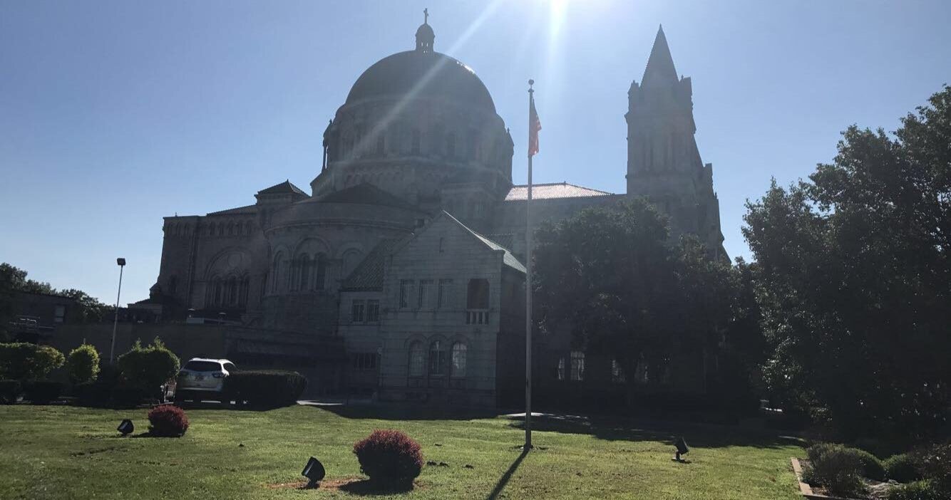
Today started out with a bit of a religious experience as I visited the Cathedral Basillica of St. Louis. This grandiose and stately church is the mother church of the City’s archdiocese (16 years of Catholicism and I’m still not entirely sure what an archdiocese is but with a lot of Catholic traditions it does sound terribly important at the very least). The building was designed by celebrated St. Louis architect Thomas P. Barnett (who also happened to be a very good painter) and its beauty has been attracting visitors since it opened to the public in 1914. My apologies if the glare from the early morning sun detracts from how impressive the building truly is.
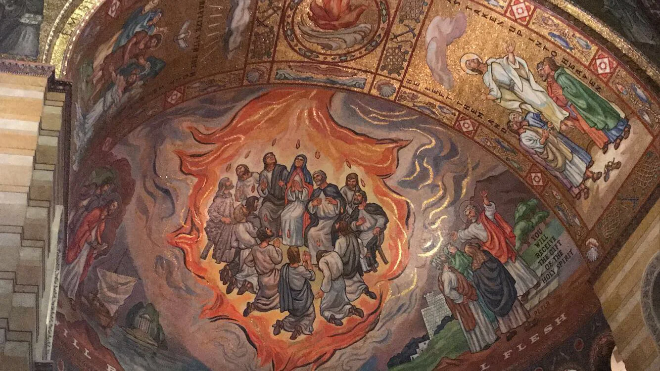
As majestic as the cathedral’s exterior is, the interiors are where you really get the jaw-dropping splendor. The imposing domes and marble arches create cavernous sense of scale, but the thing that really knocks you off your feet is the fact that nearly every inch of the ceiling is covered in magnificent glass mosaics. The mosaics in the side chapels were designed and installed by Tiffany Glass, but the main chapel mosaics were designed by an artist named August Oetken and they’re every bit as impressive as the pieces designed by the more famously named studio. On the one hand, it felt a little icky for a building that preaches charity over materialism to have spent thousands of dollars on fancy accoutrements, but on the other hand it clearly gets people through the doors (I myself likely wouldn’t have come in otherwise) so perhaps there was some good intentions behind all the razzle dazzle. Regardless, the actual artwork was breathtaking.

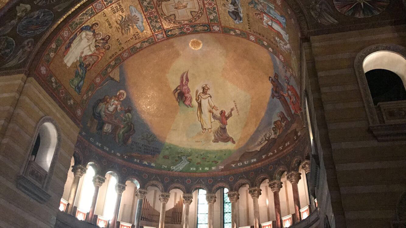


The thing that blew my mind the most was how much some of the pieces looked like flowery paintings which is insane to pull off so smoothly with little pieces of glass.
After the religious art, I decided to check out some more secular works in and around the city’s Grand Center Arts District. The district lives up to its name by housing an impressive variety of arts, including several museums and galleries, the historic Fox Theatre, The St. Louis Symphony Orchestra, and St Louis Public Radio.
With so many options, I just had to pick somewhere to start and the rest would all be easily within walking distance. My first stop of this artsy morning was the Contemporary Art Museum St. Louis (or CAM for short). The CAM was a small but beautifully designed gallery space highlighting some of the most exciting voices in contemporary art.
While I was there, the main exhibition was dedicated to three artists who had won the museum’s prestigious Great Rivers Biennial Prize. The first artist was a Ghanaian-American interdisciplinary artist named Addoley Dzegede. Here installation, entitled Ballast, was inspired by Dutch Wax prints, a technique the Dutch developed to emulate Indonesian Batik textiles. They weren’t able to sell their textiles back to Indonesia since they had no need for knock offs while the real thing was readily available, but the Dutch fabrics proved popular in West Africa, leading the Dutch to start creating more textiles with prints inspired inspired by West African designs. Inspired by this history of colonialism, commerce, and cultural exchange, Dzegede used this textile technique to create pieces that blend Pop-Art, traditional West and Central African Art, and Western abstraction in powerful ways. I’d never really seen textiles like them before, but they were incredibly vibrant and almost mesmerizing to look at.


To accompany her textiles, Dzegede also made a series of hand-cast bells inspired by Bronze Age deigns for bells used to ward off ghosts and evil spirits. They added to the space’s sense of history and magical realism.

The next Biennial artist on display was a sculptor named Jacob Stanley. For this installation, Stanley explored the idea of work and labor with a series of sculptural machines that served as the very antithesis of labor-saving devices by just creating more mess and problems. One piece featured a weight suspended at the top of a 12-foot wooden tower above panes of glass. Inevitably the weight will fall and break the glass, and that tension and anticipation the piece instills in the viewer is palpable. Another piece entitled, Recurrent Entropy,, features a rectangle of conveyor belts on which the artist places porcelain dishware. The dishware spins on the belt over and over until it falls off and breaks, which is a depressing metaphor for the cyclical grind of working for a living.


My favorite of Stanley’s pieces was entitled Accretion, which invites viewers to add a piece of paper to an ongoing stack in the center of a piece of steel. Each flimsy piece of paper is nothing much on its own, but the accumulated weight of hundreds of sheets is enough to make the much stronger steel bend. It’s a great visual metaphor that can be read positively as a statement on collective action being more powerful than an individual or more darkly as a statement on the way little daily indignities and compromises can make us buckle and break. I don’t think it necessarily has to be one or the another.


The last Biennial artist was a St. Louis native named Sarah Paulsen, who created an immersive video installation entitled The Invention of Whiteness. The installation consists of different multi-layered stop-motion animations exploring the various social, historical, and political origins of the concept of “being white”. Each animation was captivating in its own right, but Paulsen also did a fantastic job of curating the installation in inventive ways. Some videos were projected onto chalkboards to evoke school presentations, while my favorite was projected onto an antique mirror. You can see the animations in motion on her website (http://www.sarahpaulsen.com/the-invention-of-whiteness.html). Just click the title of each individual video to watch.


The hallway leading to the next galleries was adorned by a hypnotic, optical illusion mural by Swiss artist Claudia Comte entitled Electric Burst (Lines and Zigzags). It’s almost dizzying to look at but the way the lines seem to almost dance before your eyes is pretty impressive.


The next gallery feature the work of the LEAP Middle School Art Initiative. Working with celebrated costume designer and teaching artist-in-residence Robin Verhage-Abrams, the students learned different 3D textiles techniques to express themselves through different costumes. The students also studied the works and practices of the great multimedia artist Trenton Doyle Hancock to spark their imaginations, and the finished products were really incredibly impressive for such young artists.

The next exhibit was another community-focused gallery called the New Art in the Neighborhood or NAN gallery. This gallery featured the works of local artists, and the current gallery theme was inspired by sound art and the different ways artists and musicians have experimented with sound as a medium. As a visual accompaniment to the sound art, the NAN artists gathered various vinyl records and made mixed media collages on the album sleeves. It was all very pop-y and playful, and I liked seeing the different approaches each artist took their collage.


Last but not least for this museum was a gallery of works by the painter, Amy Sherald. Sherald specializes in dreamy portraits of Black Americans. I was having phone storage issues (can’t imagine why) so I only got a picture of one of her portraits, but they were all this beautiful and tenderly realized. I loved the way she blended realist portraiture with surreal and abstract flourishes in the background to really make the people pop out more. Since I didn’t do her justice, I’d highly recommend looking at more of her paintings here: http://www.amysherald.com/2018/6/4/659qfrxjj2br5b8ik8lr9ocos9n3wp

My next stop, just a short walk away, was the Pulitzer Arts Foundation, an art museum founded by Emily Rauh Pulitzer, whose husband also happens to be the grandson of Joseph “Pulitzer Prize” Pulitzer. The museum is designed to give visitors closer and more intimate encounters with art than typical larger art museums. The building was designed with this purpose in mind by renowned Japanese architect Tadao Ando (his first work in the United States), and it features large smooth concrete walls and long glass windows to create immersive cavernous galleries bathed in natural light. I think normally the concrete-heavy brutalist look is usually very prison-y and unappealing to me, but I like the way Ando built the building into the incline of the hilly street so it seems like it’s almost part of the landscape. It’s much more serene and oddly pleasant to look at than slabs of concrete have any right to be.
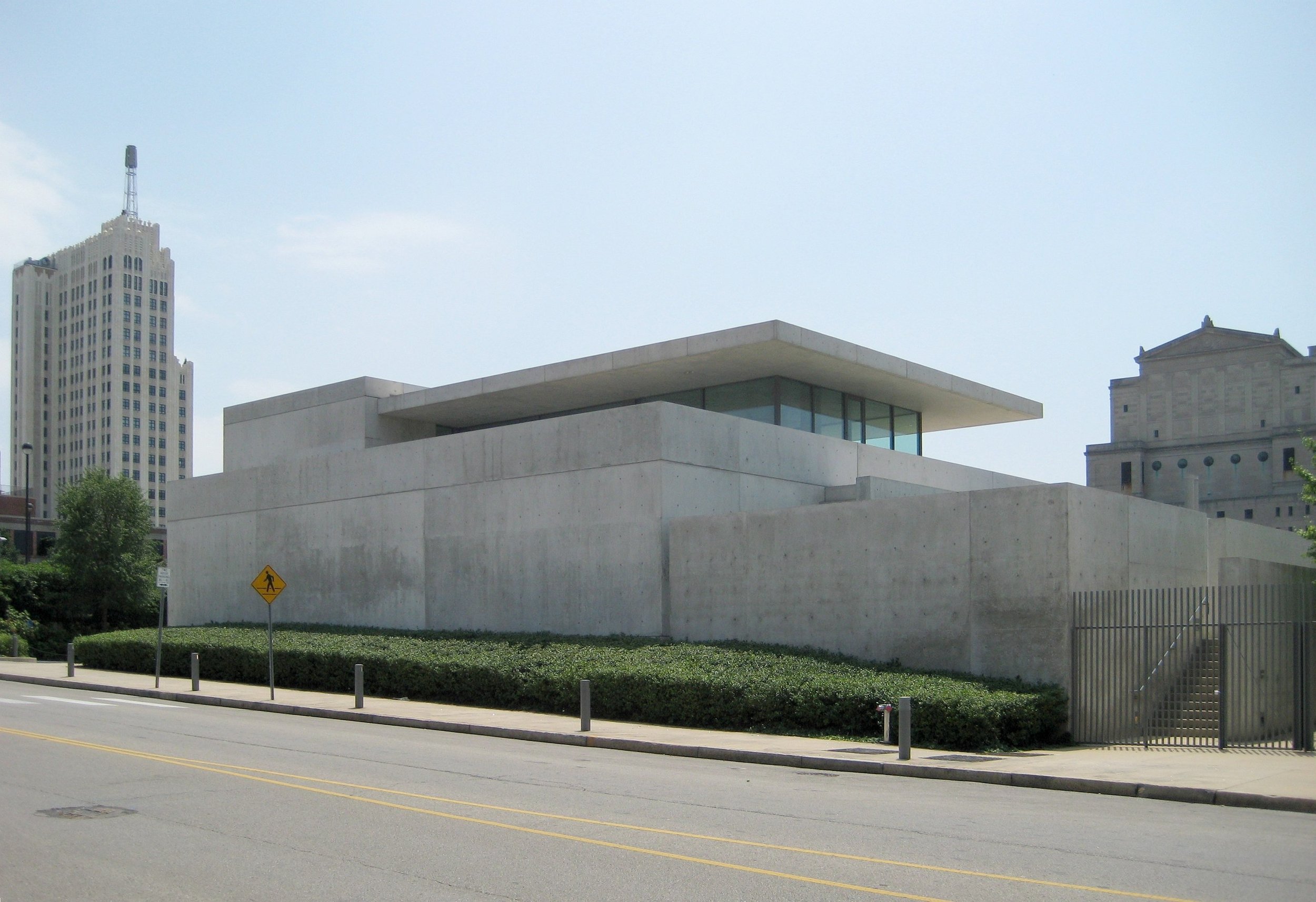
credit given where it’s due, I didn’t think to take a picture of the whole building so this is from the museum’s wikipedia page
The first thing grab my eye before I set foot in the building was a large banner hung from the side of the building’s facade, proclaiming “We are never never other”. This sunny jolt of affirmation was a special site-specific installation by the artist Aram Han Sifuentes who also started a Protest Banner Lending Library housed inside the museum.

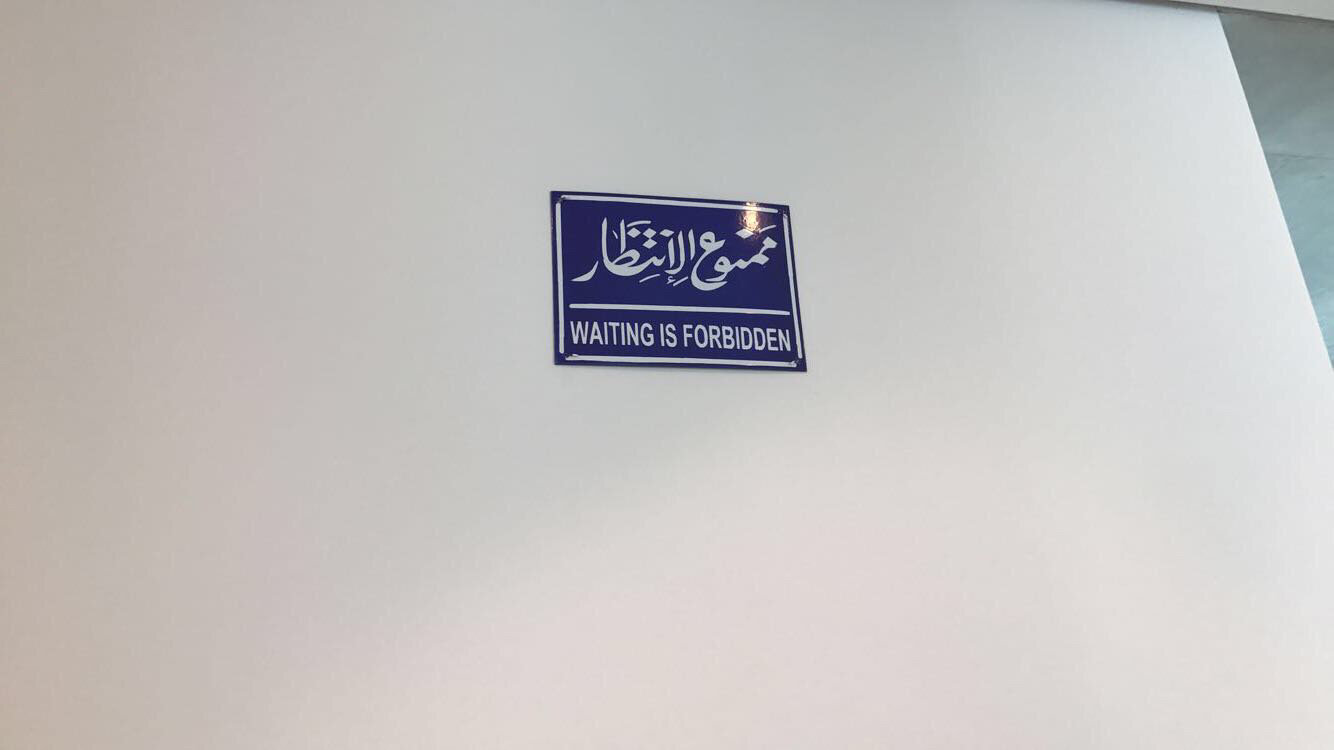
Inside the museum, the entire indoor gallery space was dedicated to a massive exhibition of works by the Palestinian multimedia artist Mona Hatoum. While an internationally celebrated artist, this collection called Terra Infirma is her first major solo-show in the United in 20 years and it’s really a showstopper. Hatoum’s works in various media are inspired by conflicts both political and personal and seek to make familiar, everyday objects seem strange and foreboding, each piece asking viewers to think a little deeper about things we take for granted. She was served very well by the museum’s gallery space, and she was able to playfully place pieces, like this mundanely ominous metal warning sign, where you might just think it was a regular part of the museum. Right off the bat, pieces like this, small on their own, create a sense of immersion where now you’re really looking at every inch of the gallery and questioning if things might have some double meaning or other purposes. It’s a pretty neat effect.
The next piece was entitled 3D cities and featured maps of Beirut, Baghdad, and Kabul with sections carefully cut out and made to be either raised or sunken, as if to demarcate areas of destruction and rebuilding. I liked that the piece very literally undoes the way maps tend to flatten out all the conflict that goes into drawing any borders.


I passed by a large window looking over the museum’s beautifully peaceful reflecting pool cleverly hidden between two wings. There’s a permanent piece overlooking the courtyard called Rock Settee by Scott Burton that looks like a giant rock that’s somehow been there forever but is actually a carefully carved bench for visitors to sit on and look at the water. It makes for a great view on or off the rock, though I did feel like a bit of an accidental creep taking my photo while this young couple was seemingly negotiating how close is okay to sit to one another.

The next piece by Hatoum might seem on first inspection like a fairly straightforward, classically-inspired ceramic sculpture, but the missing limbs, apparent bullet holes (also super technically impressive), and the pointed title “Witness” all hint at modern warfare. Even when she works with more traditionally pretty mediums, she doesn’t let the viewer off the hook of remembering the grim realities of the world. Luckily, her style has a cheekiness to it that manages to keep the whole exhibit poignant without being overwhelmingly depressing.

The next gallery featured large-scale sculptures tied together by a surreal humor and a thematic focus on the futility of labor. First up was the enormous La Grande Broyeuse, a monumentally scaled up sculpture of a common vegetable grater (complete with three backup blades) that takes something commonplace and makes it ominous with the implication of what such a large grater might be used to grind up. On the wall across from the grinder was a piece entitled Chain which featured a long string of leather work gloves sewn together and looped around an industrial pulley. The piece had an eerie beauty, and the softness of the material juxtaposed with the coldness of the aesthetic seemed to convey a mourning over the way workers tend to become thought of as just another machine. Lastly, my favorite piece in this gallery was entitled “+ and -”, consisting of a large circular container filled with sand. The diameter of the circle was divided by a motorized metal arm. One half of the arm would rake the sand and the other half would smooth it over, each arm undoing the work of the other ad infinitum. It was truly mesmerizing to watch this little Sisyphean zen garden in action (and you can too here: https://www.youtube.com/watch?v=ZxoXSUO8Y-I&ab_channel=BillFowlkes ).


The next gallery was filled with one imposing piece entitled Impenetrable, which consists of a 10 x 10 x 10 ft. cube made of hanging strings of barbed wire. The piece references the artists Jesús Rafael Soto's tactile sculptures, called Penetrables, but substitutes his use of materials where viewers were encouraged to walk through the sculpture with a material most known for keeping people out. In doing so, Hatoum undercuts the strangely calming minimalist geometry of the piece with a foreboding sense of danger, and those conflicting feelings really make it a fun work to spend some time with.
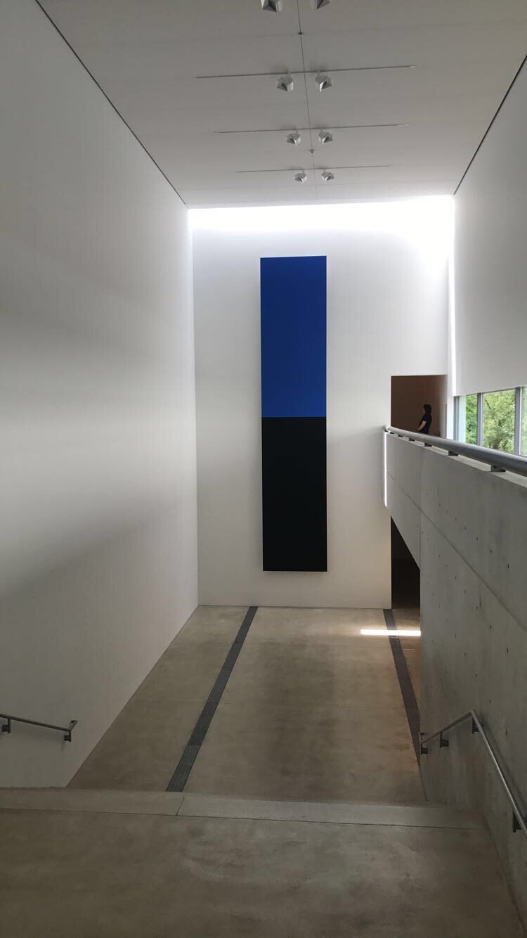
Moving to the next floor of galleries, I passed by another one of the Museum’s permanent pieces, Ellsworth Kelly’s Blue Black, which consists of two 14 feet long aluminum panels painted in the titular colors. Despite the minimalism of the piece, the scale and placement of the panels give it a strange sense of dynamism, like the blue is sliding into black, and it was a lovely complement to the architecture and Mona Hatoum’s work.
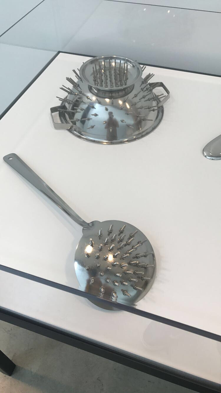
The next floor of galleries started with some displays of smaller pieces that were still sharply pointed despite their small size. First up was a piece called Still Life which featured a metal cabinet filled with what at first appears to be several beautiful blown glass ornaments until you realize that they’re all shaped like grenades and other explosives. The next display featured a series of pieces called No Way in which the artist methodically plugged the holes in various colanders and soup strainers with metal studs, stripping the utensils of their purpose and giving them a surprisingly unsettling presence. The piece Infinity is made up of bronzed soldier figurines arranged in an infinity sign as a playful critique on both the neverending nature of warfare and the way kids are primed for violence at a young age. Lastly, there was the punnily titled T42, featuring two beautiful gold-trimmed fine ceramic teacups and saucers that have been fused together as a comment on the way high society likes to make superficial overtures of solidarity and cooperation that are ultimately quite pointless.


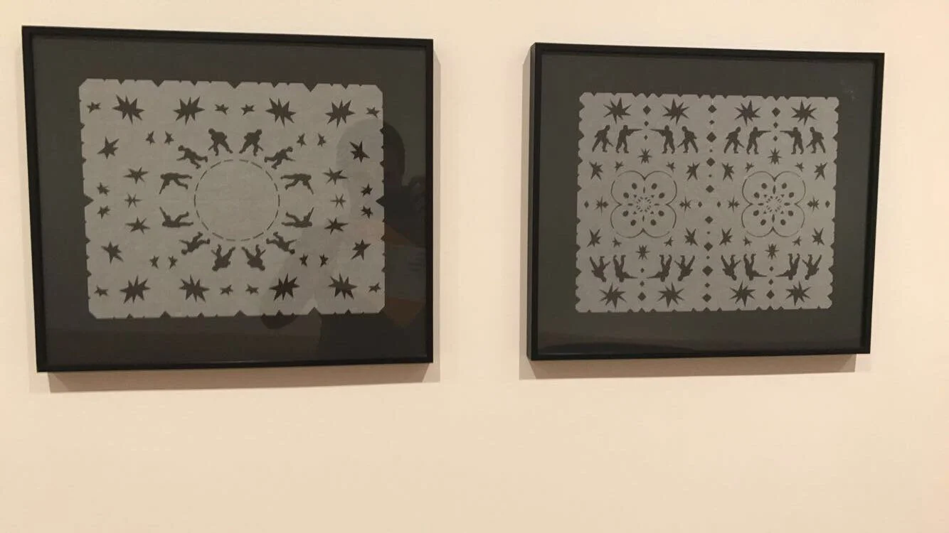
The next room featured a piece called Misbah (the Arabic word for lantern) which featured a single beautifully crafted brass lantern dangling in a darkened room. The lantern is attached to an electric motor so that spins around casting luminous stars and soldiers across the walls. It’s a fascinating mix of lovely and calming but with a disquieting edge. Across from the room, there were several cut paper snowflakes with similar military motifs.

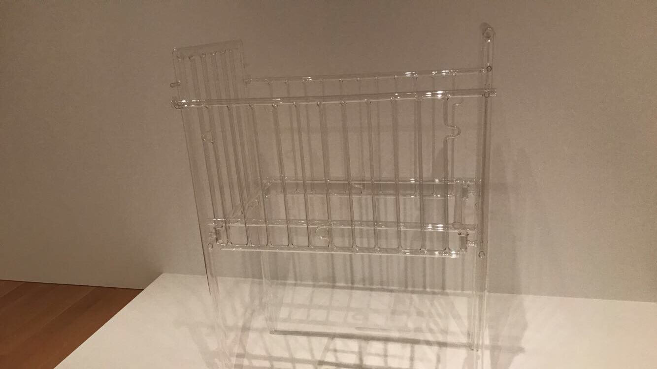
Next up was a delicately unsettling piece entitled Silence which feature’s a baby’s crib made of super thin laboratory glass. Like a lot of the works in the exhibition, the more beautiful a piece is the more completely useless it is. The fragility of the piece is completely antithetical to the goal of protecting a baby, and the tension that it could break at moment’s notice makes it hard to look away from.
Up next were some more large scale surrealist sculptures. this piece entitled A Grater Divide consists of a bedroom divider made three seven foot tall metal cheese graters. Naturally there was also a cheese grater cot across from the divider. Blown up to absurd proportions, the simple household product seems strange, violent, and disturbing showing some of the darkness that gets taken for granted in domestic life.


Across from the graters, there was a fun piece called Turbulence, which consisted of a perfect circle made out of irregularly-sized black marbles placed right on the museum floor. Each marble was individually hand-made, and I liked the way their chaotic individuality meshed with neatness of the full circle. It’s also impressive how much tension Hatoum generates from the fact that there’s nothing connecting the marbles to each other nor protecting them from the feet of visitors so the whole thing could collapse at a moment’s notice.

Even the bathrooms kept you on your toes with art in unexpected places:
After my pitstop, the next piece on display was an installation entitled Homebound. The piece featured a tableau of common domestic furniture all connected by live electrical wires. The buzzing of the electricity was amplified through two speakers so that viewers had a palpable sense of unease looking at the ordinarily benign setting. In this way, I think it was a frighteningly poignant way of showing the ways in which danger and tension can simmer beneath the surface in so many homes.


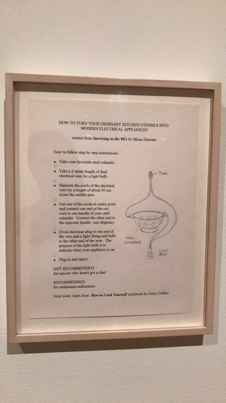
Across from the installation, there were some playfully subversive works on paper including an embroidered pattern pattern that uses a simple geometric pattern to partially obscure (or in some ways highlight) an anatomical rendering of female genitalia and some instructions for for turning an ordinary kitchen utensil into a modern electrical appliance that “Recommended for Euthanasia Enthusiasts”.

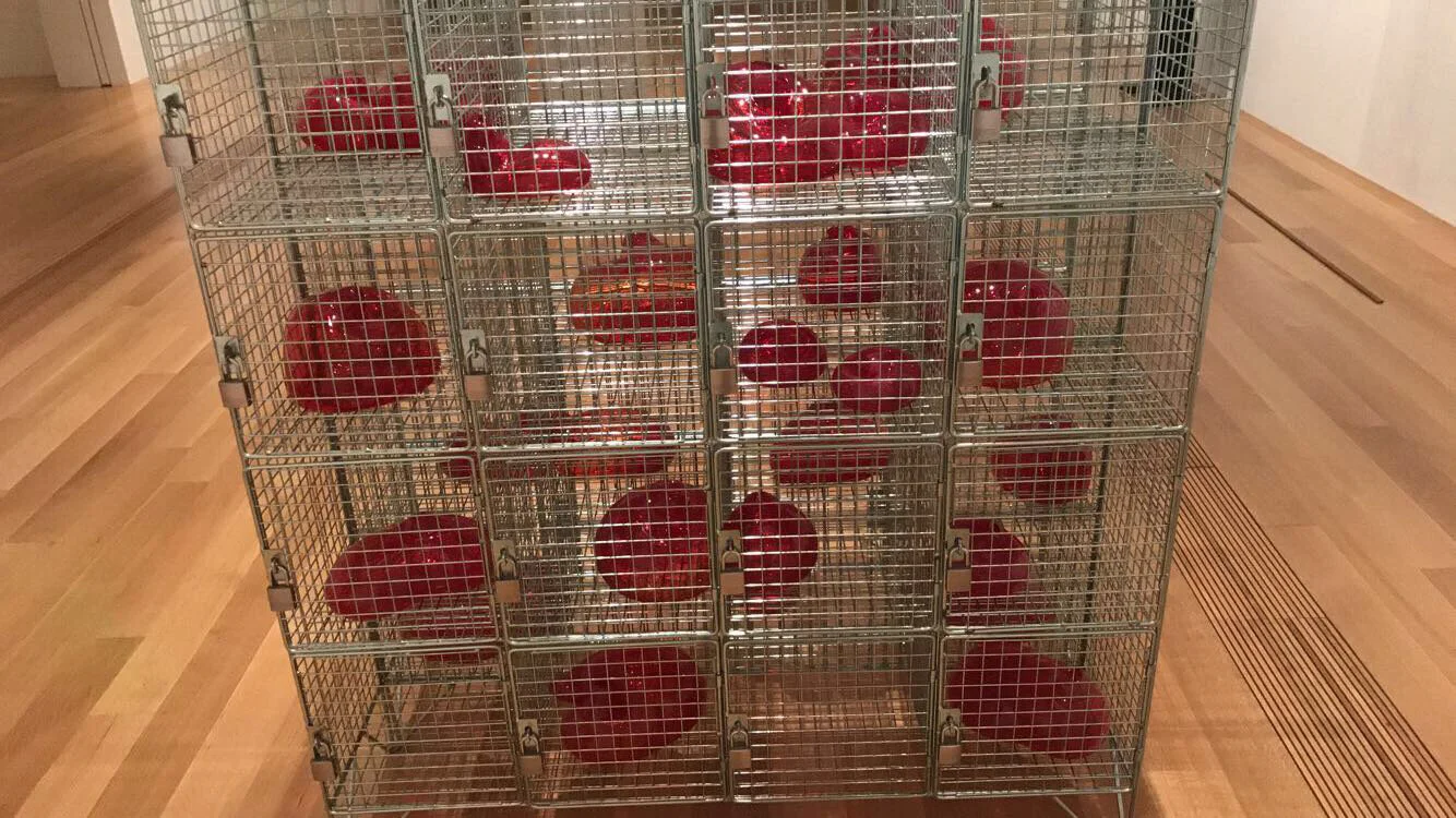
Next up was the punny and evocative Cells, consisting of gorgeous amorphous blown glass forms, resembling red blood cells, placed in small metal cages calling to mind the more penal usage of the titular word. There was something so simple yet so striking about the gentle fragile glass surrounded by such harsh solid metal.


As I walked to the next gallery, I passed by a piece that I initially thought was just an actual wheelchair that the museum had set aside in case anyone needed it. If anyone were to actually try to use it though, they’d find that the handles are actually two serrated blades, another one of Hatoum’s cleverly horrifying subversions of common objects.

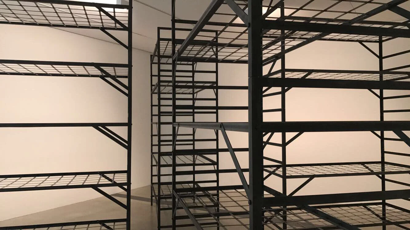
The last Hatoum installation was not necessarily my favorite but it did have an eerie power to it. The piece, entitled Quarters, featured a series of military bunk beds but slightly exaggerated by the addition of three extra beds on the frame. This simple elongation made the beds looks more like imposing cages, creating an uncomfortable parallel between prison and service. While maybe not her most aesthetic work, it was impressive that she was able to create such a strong sense of discomfort with only the slightest tweak to the existing furniture.
After finishing with the main exhibition, there was still one more small gallery featuring community artworks organized by the resident artist Aram Han Sifuents. Sifuents organized what she called the Protest Banner Lending Library featuring all manner of politically charged textiles and encouraging visitors to make and share their own.


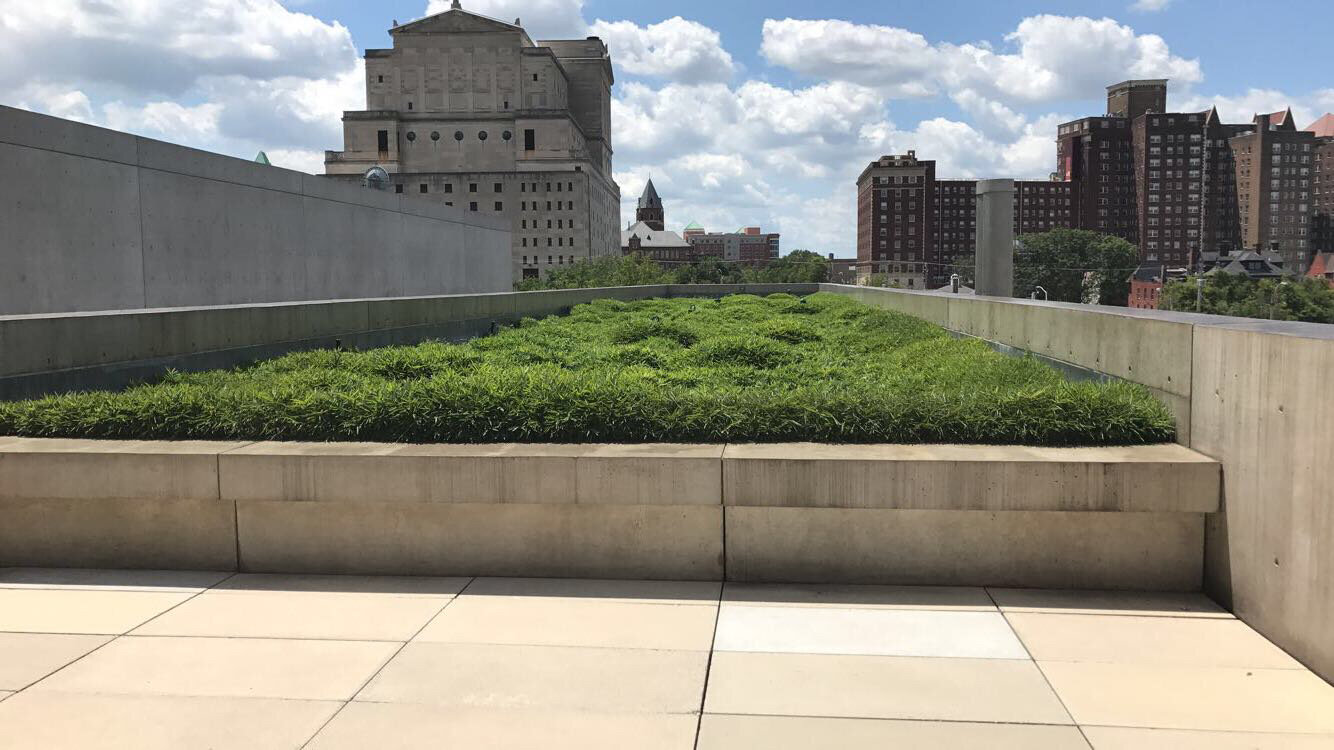
Having finished with the galleries, I explored the Pulitzer’s spectacular architecture. Strolling the grounds, I loved all the hidden natural accents that make the building more vibrant than the plain concrete might suggest. A rooftop patio featured a hidden lawn of rolling greenery which really spruces up the skyline in a beautifully surreal way.
Between the two wings, there was a gorgeously serene reflecting pool. The placement of the windows and clever drainage systems made it seem to flow outwards into infinity, which made for a spellbinding view.

Lastly, outside in the courtyard was a gigantic piece by Richard Serra entitled Joe (my kinda art). The piece consisted of a 13 feet tall irregular spiral of weatherd steel. It was an odd piece, combining its tough industrial material with a light and flowy form, but it was really fun to see it from afar and then get to walk through its labyrinthine structure. The views of the sky framed by the curving, dark, rust-colored steel were so dreamlike and magical.


After the Pulitzer, I continued on to the next museum on the street (I can’t stress enough that all the museums today are within a block of each other). I made my way to the historic Sheldon Concert Hall and Art Galleries, a venue renowned for its perfect acoustics and for having its stage graced by such notable musicians and speakers as Albert Einstein, Willie Nelson, Ernest Hemingway, Dave Brubeck, B.B King, and Herbie Hancock.
While the concert hall is the Sheldon’s prime claim to fame, their art galleries are pretty special too featuring exhibits on photography, architecture, St. Louis artists, jazz history, and children's art. While I was there, the main special exhibit was an absolute blast called Golf the Galleries, which featured different mini-golf holes created by local artists and design firms that visitors could play on while they perused the art. It was such a fun idea, and a great way to engage visitors while also allowing artists to really think outside the box.
The first hole, entitled Warped Tour, was designed by Andy VanMater and made for a fantastic introduction to the exhibition by having the artist quite literally put a twist on a traditional putting green with an impressively warped geometric construction. The green was a beautiful blend of form and function because it was striking to look at while also very fun to play on because once the ball rolled up the first incline it was unpredictable which way it might fall.

The walls of the galleries featured some beautifully thematic photographic prints by the UK-based artist Simon Martin. Martin made a series of gorgeously grandiose photos of mini-golf courses from around the British Isles. There’s a deeply surreal quality to seeing such theatrical constructions as mini-volcanoes and dinosaurs viewed so elegantly without the context of children running around trying to hit balls through them. I really loved their dreamlike quality.


The next hole was called Distortion, designed by the architectural firm Arcturis, and it featured a trippy science-fiction-y aesthetic wherein putters had to put but up a sloping curved wall that looked impossibly infinite thanks to some cleverly placed mirrors.

Next up was a hole called Alice, designed by local artist Natalie Pinson, and inspired by Alice’s Adventures in Wonderland. The playful tableau was a totally immersive art environment with whimsical details and easter eggs everywhere you looked. Even if it wasn’t the most difficult hole from a golfing perspective there was just so much to love, and you can see why the museum guests voted it their favorite hole by the end of the exhibition’s run.


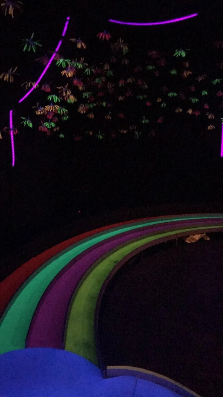
Next up was a psychedelic hole called Over the Moonbow by Gray for Scale (a collaboration between the artists Ashley Kaempf and Chris Goodin) which featured a night-time rainbow and flowery stars all illuminated by velvety blacklight. Golfers have to be careful not to be taken in too much by the scenery because depending on which band of the rainbow your ball goes down, your chances of coming in under par are drastically affected.

Next up was probably my personal favorite hole entitled Serengeti Park by Justin King. The charming and humorous hole features a lovingly crafted park filled with anthropomorphic jungle animals going about their leisurely days. All the sculptures and environmental details are remarkably crafted from recycled cardboard. The amount of life and expressive character details the artist is able to get out of such a mundane, disposable material is just fabulous.


The design firm Switch made a St. Louis inspired hole called the Gateway Green – A Hole-in-One for STL which featured some of the city’s most iconic architecture rendered in miniature, making visitors feel a bit like golfing Godzillas.

Lastly there was the pop-art razzle dazzle of Swimming With the Fishes by the artist Charles Houska. His bright, colorful, and wonderfully goofy animals serve as both decorations and obstacles, serving both roles admirably.

The walls around the hole are adorned by more of Houska’s artwork which is the best kind of pop-art, technically virtuosic yet utterly silly. It’s no wonder he’s proven to be one St. Louis’ most beloved local artists creating a number of public art pieces, scoring some prominent corporate commissions, running a local gallery, and operating an ongoing collaborative wherein he works with local school children to create murals (something his signature style seems particularly well suited for). It was a great hole to end on, and the whole golf course was one of my favorite bits of curation I’ve ever come across.


Next up was a collection of works by school children. Inspired by the main exhibit, the kids were tasked with designing their own mini mini-golf courses. It was a funny and lovable exhibit, and a fascinating peek into the brains of the city’s youth. My personal favorite piece here was entitled A Sunny Day, 98 Million Years Ago and thankfully the young artist included a warning that not all of the afro-clad dinosaurs were historically accurate.

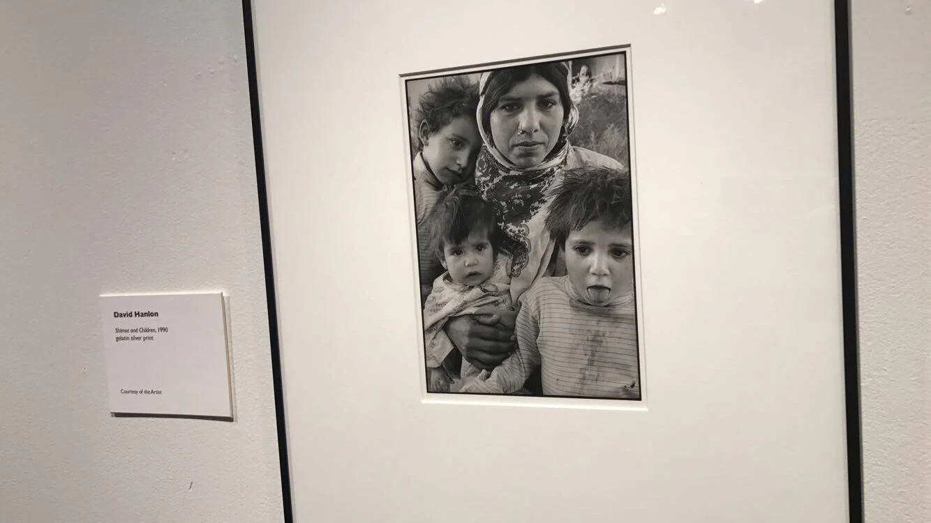
While the golfing filled most of the gallery space, there was still room for some traditional artwork. Highlights for me included: an impressively balanced sculpture of a bronze heart on what appears to be a wooden board which, on further inspection, is actually made of the same bronze but cleverly disguised by the artist Jim Dine; a meditative, interactive piece by the incredibly named artist Adrienne Outlaw called Sound Shape which features a calming guided drawing lesson by the artist instructing visitors on how to copy her elegantly simple drawing of a violin; a chaotically colorful abstract drawing by an artist whose name I didn’t think to write down; and some spectacular black-and-white photos of families in Syria by the artist and historian David Hanlon.


There was also a display of mesmerizing richly patterned lithographs by the artist Sage Dawson that seem like a dreamy hybrid of old photo negatives and wallpaper, blurring the line between prints, textiles, and sculpture.


Lastly, there was a display of massive political works by the artist Kahlil Robert Irving entitled Cortège (Malcolm, Martin), featuring large black and white prints of an American flag with all the stars sporting a bullet hole to commemorate the titular assassinated civil rights heroes. It was a bit of a somber note to end on, but a powerful piece nonetheless.

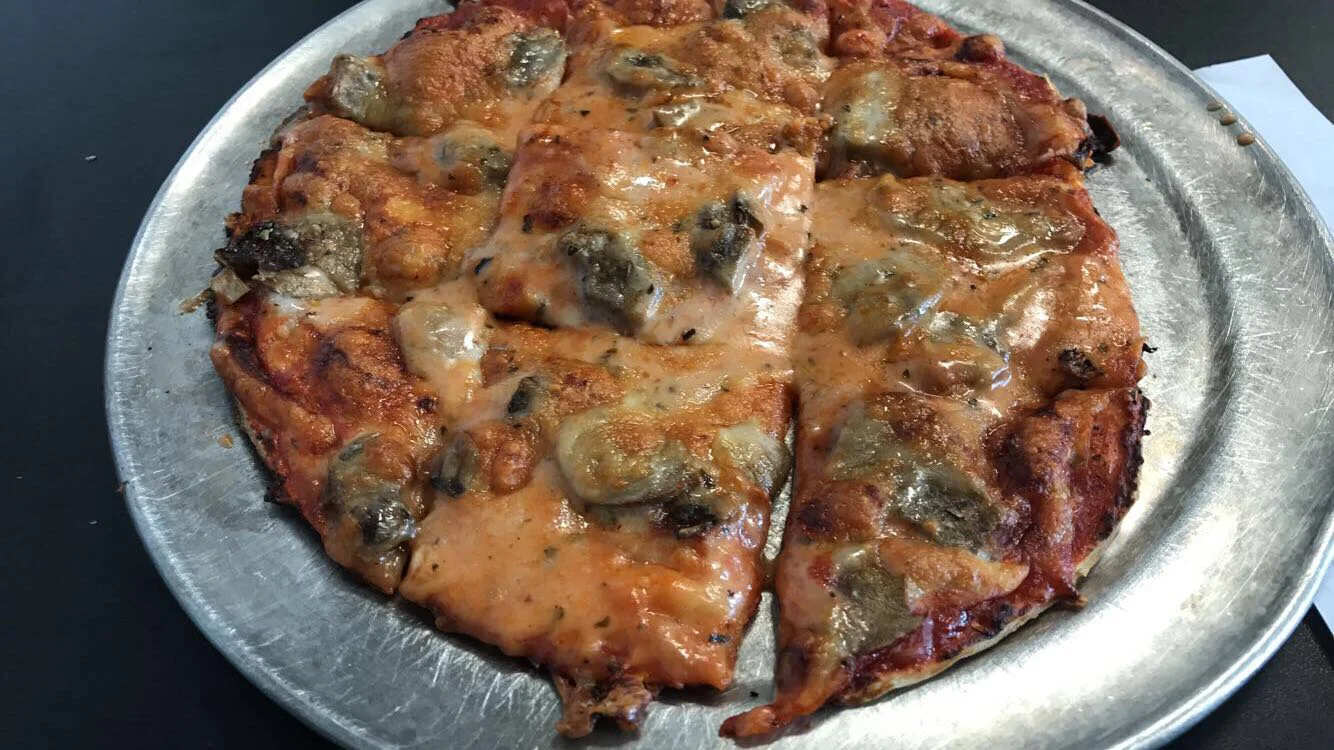
After all that museuming about, I got myself some lunch at a spot called Imo’s Pizza. They specialize in St. Louis-style pizza which is distinguished from other city’s signature pies by the use of Provel cheese, a gooey blend of cheddar, Swiss, and provolone. The soupiness of the cheese might be offputting to first-timers but the creaminess it adds combined with the crispiness of the crust made it a surprising success for this intrepid comedian. I got a small mushroom pizza with an order of cheesy garlic bread for good measure, so I’m sure my arteries were less than thrilled but my tastebuds were thoroughly satisfied.

Best of all for me was this joyously silly art on the wall of Hamlet soliloquizing to a pizza pie. Alas poor pepperoni, he knew you well.

After lunch, I decided to kick back with a tour and some brews at St. Louis’ most famous brewery, the original Anheuser-Busch Brewery. The brewery campus features a sleek modern visitor center as well as the stately red-brick historic buildings, and while I’ve never been the biggest Budweiser fan myself it’s hard not to be impressed walking in. It helps that I had just about a perfect day for it.

While I waited for my tour to begin, I got to check out a few displays showing Anheuser-Busch’s marketing materials and advertisements from their opening in 1852 to today. While it’s certainly an enjoyably solid beer, the company’s signature Budweiser beer didn’t become one of the country’s best selling beers (Bud Light is actually the #1 beer in the US) by word of mouth alone and clever marketing and promotion have been integral to the company’s success. My favorite pieces were a collection of very stylish Swiss army knives embossed with the name “Adolphus Busch” (the man who really took the company to new heights).


After perusing the displays, it was time for my tour to begin. The campus really was pretty stunning with the sun gleaming off all that red brick and the pops of green from trees and shrubberies. It almost feels like you’ve entered a small town, because the expansive grounds include 189 structures spread over 142 acres! All that space gives the tour guide plenty of time to go into Anheuser-Busch history and dole out some fun facts. The brewery was initially owned by neither Anheuser nor Busch, but a German immigrant and saloon owner named George Schneider who opened it up as the Bavarian Brewery in 1852. The brewery toddled on the brink of bankruptcy until it was purchased by a successful soap-manufacturer named Eberhard Anheuser (a mouthful of name). Anheuser fortunately kept his soap and beer separate and was able to build the brewery into a successful local business. When Anheuser’s daughter married a man named Adolphus Busch, the brewery became the first of its kind to reach beyond the local market to national recognition. Busch was the 21st of 22 children which is just bananas in and of itself, and he left Germany to seek his fortune (and presumably get some peace and quiet). Before he became a partner in the brewery, he was in the brewery supply business so he knew a thing or two about the technology behind the beer and that helped him come up with some innovations that revolutionized the company. Anheuser-Busch became the first company to adopt the practice of pasteurization in their brewing process which helped preserve the beer’s freshness for longer, and Busch came up withe idea of utilizing new-fangled refrigeration technology to ship their beer in refrigerated railcars. This allowed them to ship further than any competitors, and begin building up national brand recognition. Not one to rest on his laurels, Busch traveled to Europe to study the latest innovations in beer making, and he became struck by a pilsner from the city of Budweis in the Czech-republic. The Czech Budweiser was advertised the Beer of Kings, so naturally when Busch brought it to the states he cheekily one-upped them with the slogan, “The King of Beers”, and its stuck around for over 100 years so he must have been on to something.
My favorite historical tidbit about the brewery was how they stayed afloat during Prohibition. Partially they pivoted to producing a non-alcoholic malt beverage, or “near beer” called Bevo, but my favorite ploy was them selling off excess brewer’s yeast, malt, and hops with very detailed instructions how they could be used to make your own beer so that people would know how to avoid doing such an illegal thing. It was all but missing a nudge-nudge-wink-wink.

One of most enduring marketing strategies the company adopted was of course its use of stately Clydesdale horses to pull their beer wagons and give the beer a bit of regal aura. The first stop on the tour was to see the Clydesdale stables which feature horrifying horse head sculptures on the outside, but absolutely beautiful stained glass on the inside.


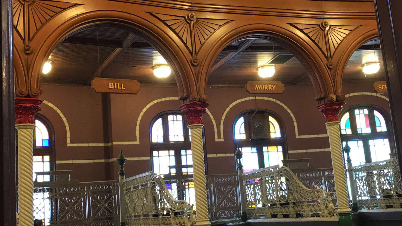
Of course, the biggest draw is the horses themselves. They’re positively massive with some of the horses reaching heights over 6 ft. tall (and they’re 3.5 feet tall when they’re born!) and it’s almost unbelievable to see them tower over you. I also loved that for all the grandeur of the horses themselves they were saddled (sorry) with such hilariously dull human names like Bruce and Lloyd.


And I have to feel like it’s no coincidence that the stables of Bill and Murry were placed next to each other…
The antique beer wagons were also pretty impressive in their own way and you can see how one of these being pulled by 4-6 monster horses through a town center might make quite the impression.

Leaving the stables, I had a better appreciation for the fact that they had to build stone arches big enough to let the horses in and out, a practicality that also added to the lofty aesthetics the brewery was striving for.

Next up we got to see the how the beer was actually made. The basics of this part of the process doesn’t really change too too much from brewery to brewery but it’s still fun to see and once again the buildings themselves didn’t disappoint.


Lastly, there was the best part of the tour: the tasting. Guests of the tour were entitled to a free beer cup of the original king of beers. Perhaps it was a placebo effect brought on by the generally impressive atmosphere of the brewery, but I felt like Budweiser never tasted as good as it did there. They also have a special limited release beers brewed by their smaller, more experimental Research Pilot Brewery. I guess one upside of being one of the most successful breweries in the world is having the money to afford to keep a team of brewmasters on staff and just let them play around and see what they come up with. While I was there, they had a strawberry wheat beer which was very summery if a touch sweet for my tastes.
It was such a warm summery day that after all my walking around I had a terrible craving for some ice cream. I went to a fantastic shop called Ices Plain and Fancy, which combined an olde-fashioned ice cream parlor aesthetic with more modern liquid-nitrogen based ice creaming methods. It was a touch on the pricier side, living up to the fancy part of the name, but it was genuinely some of the best ice cream I’ve ever had. I got a dish of their cherry cordial, which was smooth, creamy, and perfectly flavored. The big chunks of real dark chocolate were just the thing to put it over the top.


After my frozen treat, I checked into my night’s Air BnB and promptly took a nap. When I woke up, I met up with my friend Ella to take in a show at the Improv Shop. The show was called Cagematch and had two different long-form teams competing head to head to be crowned the best of the night by the audience. While I’ve primarily focused my comedy pursuits on the world of stand up, I dabbled in improv in college and there’s really something sort of magical when it’s done well and everything comes together by the seat of the performer’s pants. The fun of the show’s format is that when it all works out you’re basically getting two good shows for the price of one. That’s what happened while we were there, though improv is sort of by definition a you-had-to-be-there art form so I’m not sure it would do much good to try to recap it, but it was a blast.
After the show, we hung out for a while shooting the breeze with the other comics. Ella knew just about everyone from her own improv and stand up around the city and I recognized a few people from the week’s open mics so it made for a really pleasant and jovial hang. It helped that the Shop was a great space, with good food, good drinks, and incredibly friendly staff so it was hard not to have a nice time.
After hanging out for a while, Ella and I had paid a visit to that great stalwart of the American road trip, the late-night diner. We got a tasty midnight snack in the form of some chicken tenders and fries at the charmingly retro Courtesy Diner (pictured below taken from google because I didn’t think to do it). It was great way to end the day.

Favorite Random Sightings: a strangely confrontational bumper sticker that said “If you don't eat crust, I will!”; a bar matter-of-factly called The Honky Tonk Joint; a place called Nephew's Grille; a pet supply store called Four Muddy Paws; a bumper sticker that said "Ask me about pickles"; and an ice cream for dogs inexplicably called Sticky Charlie’s.
Regional Observation: The St. Louis Bread Company might have a familiar logo because this local chain rebranded nationally as a certain Panera Bread, which I guess sounded fancier to a national audience.
Random Joke of the Day: The cop asked, "Whose car is this? Where are you headed? What do you do?"
The miner replied, "Mine."
Song of the Day:
While I just kept my iPod on shuffle, I do distinctly remember geeking out with Ella about Jeff Rosenstock so here goes:
A fun punk song with a video that doubles as a cute lil NY travelogue. Seems fitting now that I live here