
IL Day 3 - Art, Architecture, and Arcades
Today began with Diantha taking me to the incredible (though sadly now departed), Pannenkoeken Famous Dutch Pancake Huis for brunch. The spot was a small and cozy family owned business that specialized in fantastic Dutch Pancakes, which were crispy around the edges but still soft in the middle and paired beautifully with either sweet or savory toppings. I went savory and got cheese and mushrooms, and it was one of the best breakfasts I’ve ever had. While it’s sad to read about all the businesses that have since closed since my trip, this one is feels particularly heavy since it was such a labor of love by the family who ran it and in return it was beloved by the community but they just couldn’t weather the pandemic.

After this spectacular breakfast, we made our way to the Art Institute of Chicago for a day of absorbing all sorts of impressive creative endeavors. The Art Institute happens to be the second largest art museum in the country so our visit really did take almost all day, so that means this post is going to be 90% pictures of art (and there will be a lot of it). If that’s not your thing, skip right on ahead, and even if it is your thing but you get a bit fatigued and wanna skip my writing and just look at the pictures, I don’t blame ya.
The first gallery we went to was the Art Institute’s glass paperweight collection. Diantha had told me that this was one of her favorite parts of the whole museum, and I’ll admit I was skeptical because paperweights seem like they would be so unremarkable. I quickly learned how wrong this notion was, and I was a pretty instantaneous convert to the gallery’s fan club. I’d seen paperweights my whole but never fully appreciated the quietly impressive illusion of seemingly suspending glass sculptures within the little glass domes. While the gallery gave me a greater appreciation of the humble paperweight, these were anything but humble paperweights featuring truly dazzling arrays of shapes, colors, and glass artistry.


My personal favorite was thins funky guy featuring a very geometric polyhedron in lieu of the more traditional dome, causing the different facets of outer glass to reflect and refract the patterns of the inner glass in a very psychedelic way.

After the paperweights, we moved on to a special exhibit called Never a Lovely So Real: Photography and Film in Chicago 1950-1980. The photos were beautifully rendered snapshots of both everyday and major moments in the city during this tumultuous period in history. The first half of the gallery focused on Chicago’s South Side and show pretty inspiring and horrifying moments from the road to Civil Rights. Highlights for me included: a powerful photo of MLK by Robert Sengstacke; a photo and accompanying poem by Chicago’s own Gwendolyn Brooks; a photo of Fred Hampton by Bob Crawford that beautifully and tragically captures just how young he was (only 21 when he was killed); photos by Darryl Cowherd of a gang of white youths protesting Dr. King’s arrival in the city and a much more lovable photo of a young girl holding up a Black Power poster; and a series of photos by Gordon Parks (an incredible photographer for Life Magazine who also went on to direct Shaft) documenting Black Muslim life in Chicago in the 60s documenting daycares, religious services, and perhaps most strikingly self-defense classes where young men learned how to protect themselves should they be attacked by either criminals or the police.


My favorite photo here was on by Gordon Parks of a group of Muslim women that I think is just stunningly composed and almost looks a bit like an expressionist painting without losing any of the humanity in each woman’s face.

The other half of the gallery featured photographs from the North Side of the city, and while these lacked some of the emotional heft of the works regarding Civil Rights they still had a lot of the grit and charm the city is known for. My favorite photos here were photos by Danny Lyon capturing various groups of endearingly sassy children; and Luis Medina’s more unsettling portraits of youths in various gangs around the city.


Along the wall leading out of the exhibit was a gigantic mural by Karel Martens called Dutch Clouds. Up close, the piece looks like nothing, consisting of various random symbols and computer icons, but when you step back it all becomes a beautiful scene of rolling clouds in a blue sky. I don’t know how well my photo captures the effect (though I hope you can see it a little), but it makes for a pretty spectacular optical illusion.

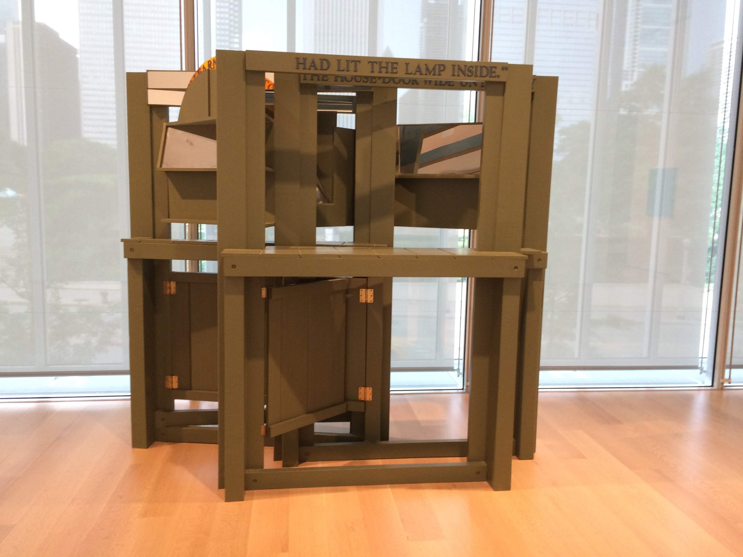
Next up was one the Art Institute’s signature galleries: the Thorne Miniature Rooms. These tiny wonders were the brainchild of Narcissa Niblack Thorne, an artist who married the heir to a massive department store fortune. Thorne had a lifelong love of dollhouses and a hefty collection of miniature furniture, and supposedly the idea for creating elaborate model rooms started partially as a way of displaying her collection. Because of the Great Depression and her own husband’s fortune, Thorne was able to hire incredible but unemployed craftsmen and artisans to help create richly detailed and period-specific rooms that showcased different architectural styles and fashions in decor across different countries and time periods. While it started as a fun hobby, Thorne found people became interested in seeing these little marvels and she would exhibit them to raise funds for various charitable organizations. The ridiculous attention to detail in each room was simply jaw-dropping and it felt like each spot was actually being lived in which was sort of magical.


After the miniature rooms, we made our way out of the basement up to the museum’s European wing, which was being guarded by this bony boy AKA Hero Construction by Richard Hunt.

The first European gallery we visited featured some pretty insanely detailed etchings, which seem extra impressive when you consider how much less realistic paintings from the same period were in terms of anatomical realness. Highlights for me included: Nicolas van Haften’s charmingly timeless Three Smokers at a Window; Hendrick Goltzius’ almost pornographically muscular Hercules; Christoffel Jegher Farnesian’s slightly less statuesque rendering of Hercules in the act of slaying Envy; the wonderfully named Stefano della Bella’s etching of a Colossal Statue carved right into a mountainside; Jan Muller’s dark but impeccably rendered Rape of a Sabine Woman; and one whose artist I couldn’t find showing a fairly intense intense biblical battle.


My absolute favorite etching though was this Pieter Bruegel inspired piece by Pieter van der Heyden called Big Fish Eat Little Fish which lives up to its title but also features a delightful number of insane little details in the background including fish with legs running off with other fish, comically large kitchen knives, and wild flying fish.

Amid all of the etchings, there was this impressive ivory sculpture by Simon Troger featuring a kindly old man giving a piggyback ride to a giant-headed child.

Next up were some galleries of pre-19th century European art, which don’t tend to be my personal favorites. There are only so many Baby Jesuses you can see in one sitting. But Diantha studied art, and she really liked this period of art history so she was able to point out and notice things I otherwise wouldn’t have stopped to think about, which made the whole time we were there more enjoyable.
Highlights for me included: a sweet and lovely allegorical painting called Meekness by Eustache Le Sueur; a dramatic painting of The Abduction of the Sabine Women (kind of a disturbing episode to feature in so much fine art) by Luca Giordano; a painting whose artist I couldn’t track down of a saint wearing a robe decked out in more saints in case you just can’t get enough saints; a beautifully rendered but strikingly vilent painting by Bartolomeo Manfredi of Cupid being held down and whipped by the God Mars; a surprisingly modern and gemoetric painting called Christ Receiving the Children, from 1655(!) by Sébastien Bourdon; a starkly lonely painting of Penitent Saint Peter by Jusepe de Ribera; a painting of Danae being impregnated by Zeus as a cloud of golden mist (another weird mythologival tale to pop up fairly frequently); a charmingly rude etching by Claude Mellen of Cupid-like babies inspecting a naked woman hilariously titled The Mousetrap; an impressively bizarre painting of The Infants Jesus Christ and Saint John the Baptist (who appear to have bright red clown hair) by Joos van Cleve; a poweful portrait of Judith discarding the severed head of Holofernes byJan Sanders van Hemessen; a very theatrical painting (It looks like Venus is drawing the curtain on the whole scene) called Venus and Mars with Cupid and the Three Graces in a Landscape by Domenico Tintoretto; a tender painting of The Holy Family with Saints Elizabeth and John the Baptist by Peter Paul Rubens that takes a surprisingly everyday approach to its Biblical figures; a whimsical painting of the The Nativity featuring a flock of angels carrying the baby Jesuse by Master of the Historia Friderici et Maximiliani; a painting of Jupiter being rebuked by Venus wherin he looks hilariously grumpy about the whole thing by Abraham Janssens; and part of a Triptych of scenes of the Virgin Mary meeting with saints featuring the absolutely bonkers of image her being surrounded by dozens of miniature women.


My favorite paintings from this time period were by Domḗnikos Theotokópoulos better known as El Greco. His pieces always have a sort of dreamlike sheen to them that I love almost like they’re painted on velvet, and he feels like a bridge between Renaissance and Surrealist painters. Highlights at the Art Institute included: Saint Martin and the Beggar; The Assumption of The Virgin; Christ Taking Leave of his Mother; and The Feast in the House of Simon


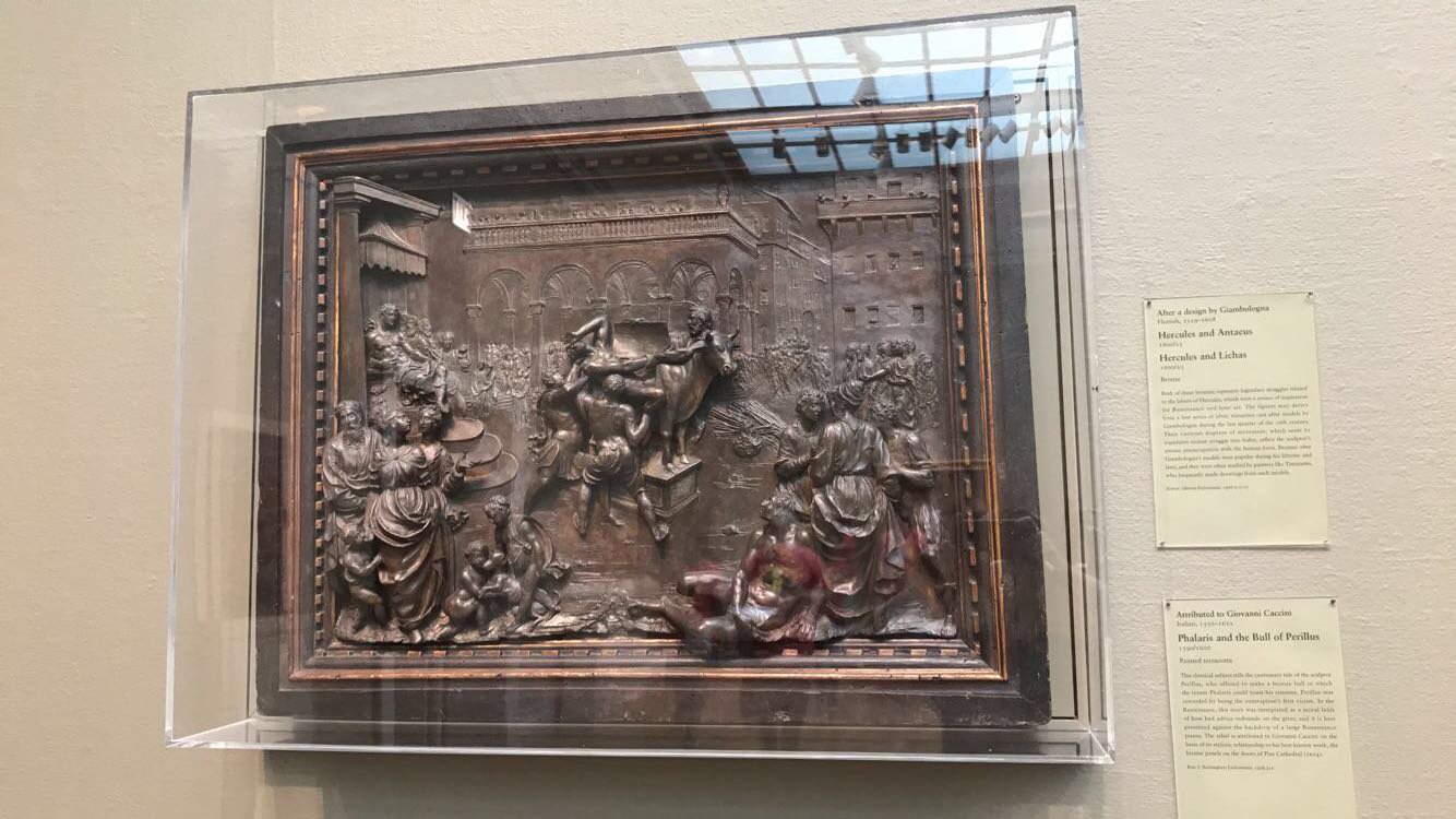
These paintings were complemented by a number of bronze and marble reliefs that sort of straddled the line between two and three dimensions. My favorites of these included: a humorous marble piece by Gerard van Obstal depicting a raucous procession of rotund drunken followers of Bacchus; a bronze piece by Alessandro Vittori called The Annunciation which features some almost psychedelic angels popping out of the sky; and a bronze relief by Giovanni Caccini depicting a story about the tyrant Phalaris and the Bull of Perillus, a torture device which Phalaris commissioned and promptly became the first victim of.


Next up were some more pre-19th century pieces that began to get a bit more realism in them and explore more common subjects than Gods and Royalty. Highlights for me here included: a portrait of Vulcan, the blacksmith to the Roman Gods, who would look like a fairly regular blacksmith if not for his cyclops assistant, by Hendrick Goltzius; a charming and impressively realized painting of a boy blowing out a candle by Gerrit van Honthorst which seems to radiate out light; a lovable portrait of a street musician entertaining a crowd called The Rommel-Pot Player by a follower of Frans Hals; a somber but gorgeous landscape painting with the Ruins of the Castle of Egmond by Jacob van Ruisdael; a spectacularly architecturally detailed painting of the Interior of the Oude Kerk (a Dutch Gothic church) by Emanuel de Witte; and a vibrant rural landscape painting called The Watermill with the Great Red Roof by Meindert Hobbema.


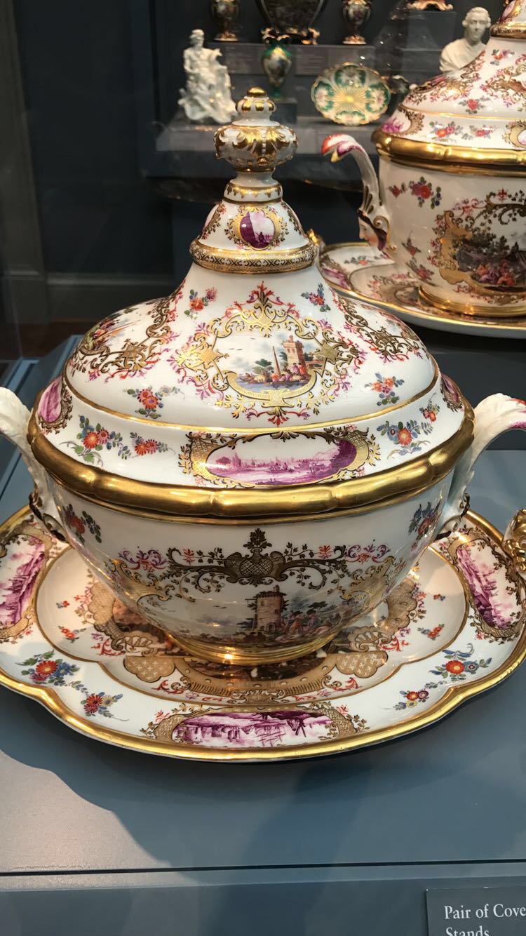
Next up was a display of decorative arts which showcased ornate ceramic, glass, and metal wares that would have spiced up the homes of upper-class Europeans in the 17th and 18th centuries. Almost all of these things seem absolutely ridiculous to have in your home and actually use for eating off of or serving guests but it’s hard not to appreciate the craft involved.


Possibly the most simultaneously impressive and absurd piece was this gigantic porcelain vulture that was stunningly lifelike but, since its a vulture, also sort of horrifying to just display in your home.

To accompany these ornamental decorative works was an equally elaborate painting of Christ turning water to wine.

The next gallery of paintings focused on portraiture. Highlights for me included: a very sweet old lady-esque portrait of someone named Mathe-Marie Tronchin by Jean-Ettiene Liotard; a paiting of a very fancy lad riding on a ram by Francisco José de Goya y Lucientes; a charmingly rustic portrait of a man dressed in what is described as a Spanish costume (though I’d be fascinated to know what is so exceptionally Spanish about it) by Jean Honoré Fragonard; and a gauzy, fantastical portrait of a young lady holding a parrot by Rosalba Carriera.


My favorite of the portraits was this dreamlike red-brown engraving of a sleeping woman made by Jean-Baptiste Lucien based on a drawing by Jean-Baptiste Greuze.

Two non-portrait pieces I really loved were these architectural paintings by French painter Hubert Robert, The Landing Place and The Old Temple, because they had such a rich sense of mood and atmosphere.


Along with these paintings, there was a really intricate silver carving of the Crucifixion of Saint Peter by C. Luigi Valadier that was pretty mind-blowing in its expressiveness.

Next up we moved into the 18th and 19th centuries with works that were starting to move away from strict realism for a more heightened focus on gesture, color, and emotion. Highlights for me included: a smoky, ominous painting of The Eruption of Vesuvius by Pierre-Jacques Volaire; an expressive sketch of the Oath on the Rütli, a dramatized scene of different Swiss leaders joining together to pledge to overthrow the ruling class, by Henry Fuseli; a real spooky painting of the Head of a Guillotined Man by Jean Louis André Théodore Géricault; an emotional study for the Head of a Damned Soul from Dante’s “Inferno” by Henry Fuseli; a dynamic, turbulent painting by Joseph Mallord William Turner called Valley of Aosta: Snowstorm, Avalanche, and Thunderstorm; a hilariously unflattering painting of John Milton dictating Paradise Lost to his Daughter (which is apparently actually how the epic poem was recorded) by Henry Fuseli; a beautifully sun-dappled painting called Pergola with Oranges by Thomas Fearnley; an emotional painting of The Death of Procris, a scene from Greek mythology where a newlywed Cephalus accidents shoots his bride mistaking her running to him in the woods as a wild animal, by Benjamin West; and two gorgeously stark rural landscapes, Monte Pincio by Jean-Baptise-Camille Corot and The Imperial Palace on the Palatine by Paul Flandrin.


My favorite piece in these galleries was a real action packed scene by J.M.W. Turner called Fishing Boats with Hucksters Bargaining for Fish.

At the center of one of these galleries was a gleefully bizarre sculpture by Antoine Louis Barye depicting mythological figures Roger and Angelica riding a winged horse away from a sea serpent that resembles a very wiggly dolphin. As a fun accidental bonus, I also captured a toddler trying to make heads or tails of what she was looking at.

The next gallery featured works of Realism depicting rural landscapes and everyday people going about their lives. I really liked these pieces and they had a fun vitality to them that set them apart from the stuffier, more formal portraits. Highlights for me included: a cute landscape featuring a solitary dogwalker, a secluded farmhouse, and a watercolor-y aesthetic called The Banks of the Marne in Winter by Camille Pissarro; an amusingly dynamic painting of a boy drinking water straight from a pitcher by Édouard Manet; a very lovable portrait of an older woman sitting at a table holding a flower and looking like she is really bemused at the whole idea of someone painting her; a really gorgeously rendered painting of a female fieldworker standing in the sunset called The Song of the Lark by Jules Adolphe Breton; a dramatically blurry painting of two farms battling the elements entitled The Storm by Georges Michel; a dreamy but candid portrait of a woman named Gabrielle Borreau by Gustave Courbet; a shimmery, vibrant painting fittingly named Pond in the Woods by Narcisse Virgile Diaz de la Peña; and a cute painting of a young shepherd and his flock by Jean-François Millet.


The piece that struck me the most was entitled Jesus Mocked by the Soldiers by Édouard Manet, which felt like it was both more religious than most Manet paintings and more impressionistic than most biblical paintings from that time with its stark black backdrop and expressive brushstrokes. I also liked the focus on the human aspects of the casualness of the soldier’s cruelty and Jesus looking almost bored with having to deal with such pettiness.

Next up was a series of dreamlike, haunting drawings and etching from a series called Woman (a bit on the nose) by Albert Besnard. I really liked how they alternated between more dramatic scenes and more introspective brooding pieces, showcasing at least a bit of an attempt to explore the inner lives and daily struggles of the female subjects rather than just their bodies.


Next up was a gallery of more romanticized 19th-century paintings which traded in strict realism for bolder colors and a greater focus on mythology and allegory but with a greater sense of how human bodies and perspective actually work than in similar works from previous centuries. Highlights for me included: a lovely painting of two women stringing up garlands for a festival by Sir Edward John Poynter British; a dramatic and dramatically bloody battle scene called The Defense of Paris by Jean Louis Ernest Meissonier; a charmingly bizarre allegorical painting called Time, Death and Judgment by George Frederick Watts; a luminous sensual painting called Odalisque by Jules Joseph Lefebvre; an enigmatic portrait of a woman lost in thought by Jean Léon Gérôme; and a beautifully painted but sort of ominous painting of two women bathing by William Adolphe Bouguereau.


Alongside these paintings, there was an incredible sculpture called Bust of Said Abdullah of the Darfour People by Charles Henri Joseph Cordier which was stunning in its level of detail on the hair and fabric and for being a work of art by a 19th-century white European that actually depicted someone of African descent like a real human being instead of a caricature.

Next up we moved into the museum’s Impressionist galleries which are some of the most famous in the country. The Artis Institute has works by some of the biggest names in Modern art and it’s a real treasure trove walking through these galleries and just coming face to face with different masterpieces. Highlights in the first gallery included: a hazy dreamlike painting by Degas called Yellow Dancers (In the Wings); a candid nude by Antonio Mancini where you feel like maybe he didn’t tell the model her nipple was showing called Resting; a charmingly mischievous painting by Degas entitled Young Spartan Girls Challenging Boys; a moody painting of paintings called The Print Collector by Honoré-Victorin Daumier; a quietly unnerving painting by Jean Francois Millet of a couple shearing sheep; a painting of a steamship smoking up a harbor filled with mostly sailboats by Édouard Manet; a shimmering beautiful painting entitled Bathing Nymphs and Child by Jean Baptiste Camille Corot; and a Degas color pencil drawing of a ballerina beneath some colorful glimmering lights.


To really cement Degas’ status as a brilliant artistic polyglot, the paintings were complemented by some small sculptures he made of ballerinas to explore how to render lifelike and fluid movement.

While Degas’ sculptures featured an attention to realism, his contemporary Honoré Daumier (also primarily more well-known for his 2-dimensional work) went broader with his sculptural works making hilariously lumpy caricatures parodying the French aristocracy. His pieces looked like a rogue’s gallery of deformed Dick Tracy villains and I loved them.


Other highlights included some absolutely beautiful paintings by celebrated Impressionists that skewed more towards realism. On the left was an endearingly pompous but richly textured painting by Gustave Caillebotte entitled Paris Street Rainy day and on the right was a serene painting by Monet entitled On the Banks of the Seine, Bennecourt.


The next gallery featured the works of the great Pierre-Auguste Renoir, whose Impressionist masterworks almost seem to give off their own light. My favorites included: a stormy seascape aptly named Seascape; a beautiful painting of a vase full of chrysanthemums; a ghostly portrait of a young woman playing the piano; an idyllic scene of a father and daughter looking out over a lake; a beautifully lackadaisical scene of a group of friends sharing lunch; a stoic, graceful portrait of a woman doing laundry; and a charming scene of two young acrobats who don’t seem all that into their current performance.


After all the traditional prettiness of the Renoir paintings, I was pretty blown away by just how gross pointillism could be in Gustave Caillebotte’s Calf’s Head and Ox Tongue, a still life of the titular viscera that was both formally incredible and incredibly disgusting. I loved it.

Next up came one of the Art Institute’s most famous acquisitions: Georges Seurat’s A Sunday Afternoon on the Island of La Grande Jatte. It’s a monumental work, massive in scale but comprised of just tiny dots of color, It would be impressive enough even without the mysterious dreamlike composition that really sucks you in. The piece has inspired numerous other artworks, most notably Stephen Sondheim’s musical Sunday in the Park with George and John Hughes’ love letter to Chicago Ferris Bueller’s Day Off, and it’s not hard to see why people keep coming back to it. I just can’t believe that for such a famous piece of art, somehow up until I saw it in person I had no idea that one of the ladies in it had a monkey on a leash. What a wonderfully weird detail.


Up next was room filled with works by Claude Monet, which were characteristically stunning. Highlights for me included: Cliff Walk at Pourville; Rocks at Port-Goulphar, Belle-Île; and The Petite Creuse River.


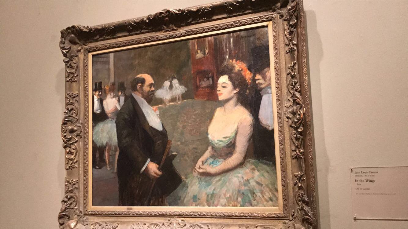
The highlights for me in the next Impressionist galleries included: an enigmatic and colorful painting by Paul Gauguin called Arlésiennes (Mistral) painted during an extended stay with his best frenemy Vincent Van Gogh; a painting of the backstage shenanigans at an opera house called In the Wings by Jean Louis Forain; a small but richly detailed study for the larger painting Bathers at Asnières by Georges Seurat; and a glamorous painting by Louis Anquetin called An Elegant Woman at the Élysée Montmartre that looks almost like it was made of stained glass.


The next gallery was one of Diantha’s favorites and featured the works of that great Bohemian painter (of Moulin Rouge fame) Henri de Toulouse-Lautrec. His paintings had all the color and technical skill of his fellow Impressionists, but with streaks of bizarreness and darkness that presage the modernists and surrealists. It helps that he had a super weird life as he was exiled from his aristocratic home due to having been born with numerous physical deformities, and he only ever felt at home among fellow artists, alcoholics, and prostitutes. Highlights included: an almost Picasso-esque painting of circus performers painted on animal skin; a large moody scene entitled At the Moulin Rouge; and an energetically, expressive painting of Ballet Dancers in dreamlike motion.


The next gallery was dedicated to the works of Vincent Van Gogh, who is one of those big names where I’m always pleasantly surprised by just how much he lives up to the hype. His brushstrokes and color choices are always so distinct you could never mistake him for anyone else. Highlights for me included: a painting of a scenic overlook in Paris entitled Terrace and Observation Deck at the Moulin de Blute-Fin, Montmartre; a tranquil scene called Fishing in Spring; a vibrantly offbeat painting of a Bedroom; and a hazy nature scene called The Poet’s Garden.


My favorite piece though had to be this scene entitled The Drinkers which featured three men sharing a drink and a little baby doing his best to get in on the action.

In the next gallery, my favorite painting was the strikingly composed The Harvest of Buckwheat by Paul Sérusier. I just loved the way it played with perspective so it looks like you’re seeing the scene over a bushel of flowers all the way down to the rolling hills in the distance. It really sucks you in, and I could have just stared at it for ages.

Across from the painting was an uncharacteristic piece by Paul Gauguin called Earthly Paradise that featured the painter tackling decorative arts with a fine sculpted cabinet with carved figures and animals in the woodwork. Gauguin is probably my least favorite of the famous Impressionists (he’s just such a creep), but it was hard not appreciate the craftsmanship here.

Next up were more Monets featuring some of his most iconic motifs including water lilies, hay stacks, bridges, and lots of dazzling colors.


The next room was one of my favorites and it was dedicated entirely to the weirder side of 19th century art with pieces inspired by dreams and fantasy. Highlights for me included: a ghostly but beautiful nighttime forest scene called Fisherman’s Cottage by Harald Oscar Sohlberg; a wonderfully insane painting of frolicking mermaids, a harp-playing moss-covered triton, and three strange goblins in the background called In the Sea by Arnold Böcklin; a hazy, lovely painting called Girl by the Window by Edvard Munch; and a bizarre garden scene called The Sacred Grove, Beloved of the Arts and the Muses by Pierre Puvis de Chavannes (hilarious name) featuring levitating women and casual nudity.


But obviously my favorite thing in the whole gallery had to be the utterly absurd sculpture of a hideous half-man-half frog embracing an actual frog entitled Le Grenouillard (Frog-Man) by Jean-Joseph Carriès. Just mind-blowingly strange stuff. I loved it.

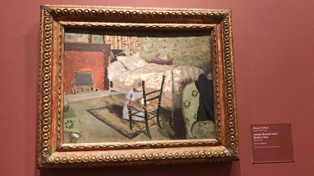
Back in the world of realism, highlights in the next gallery included: a sweetly candid painting entitled Child Playing: Annette Roussel in Front of a Wooden Chair by Édouard Vuillard; a dreamily geometric painting called Easter Mystery by Maurice Denis; and a charmingly floral painting by Édouard Vuillard called Landscape: Window Overlooking the Woods.


The next gallery was dedicated to decorative arts with some of the funkiest crafts and homegoods I’d ever seen. Highlights included: a clock by Charles Rennie Mackintosh that resembled a sort of art deco jellyfish; an insanely ornate decorative doily with a sort of bucolic fairytale scene; a beautiful wooden Manxman Pianoforte, a kind of piano that was made to seamlessly made to blend into the home aesthetic by resembling a cabinet when the piano was concealed, designed by Mackay Hugh Baillie Scott; an honestly very creepy but excellently sculpted piece in the form of a rail-thin Kneeling Youth by George Minne; an Armchair designed by Arthur Heygate Mackmurdo featuring a lovely repeating pattern in the cotton upholstery depicting a trumpeting angel over tangled roses and vines; and a slightly insane but visually stunning altar piece called Ad Astra by Axeli Gallen-Kallela.


Even the wallpaper in this gallery provided some spectacle with swaths of textile art amongst the more 3D crafts. My favorites included a funky geometric pattern called Santa Sofia by Josef Hoffman and elegant almost regal floral print called Poppyheads by Koloman Moser.


Lastly there one was more gallery of Impressionist works before leaving the European wing. Highlights here included: a psychedelic Tahitian landscape by Paul Gaugin entitled Day of the God; a more slice of life Gauguin entitled Why Are You Angry?; a serene, luminous painting of a woman washing her feet in the river by Camille Pissarro; a beautiful proto-Cubist landscape painting of the Bay at Marseille by Paul Cezanne; another peaceful peasant study by Camille Pissarro; an amorphous but lovely painting of a group of bathers by Paul Cezanne; a richly textured Pissarro painting of peasants making hay; and a bizarrely composed but sort of mesmerizing painting entitled The Hibiscus Tree by Paul Gauguin.


After the European wing, we made our way to the Art Institute’s wing for American Art which was introduced by one of their most famous and astounding pieces: Georgia O’Keeffe’s massive and mesmerizing mural Sky Above Clouds IV. The piece has become iconic and features into the museum’s advertising, and it’s easy to see why it strikes a chord with visitors. It’ colors are gentle and comforting but the choice of viewing something so familiar as clouds from the exact opposite angle as usual creates a disorienting effect in a pretty uncanny way. It also helps that the painting is genuinely huge, clocking in at 8 ft. tall and over 20 ft. long, so it would be pretty impressive as just a physical accomplishment (and Georgia was 77 years old when she painted it!) even if you didn’t care for the content. But that size and the clever use of perspective really makes the clouds seem to stretch out into infinity before your eyes. The more you look at the more sort of magical it becomes.

The first gallery we visited in the American wing was dedicated to works by the strange surreal early 20th century Modernist, so we were kicking things off with some of my favorite kinds of paintings. Highlights for me here included: a dynamic painting filled surreal and ominous apocalyptic imagery entitled The Rock by Peter Blume; a stylishly impressionistic (almost proto-Pop Art-y) painting by Milton Avery called Conversation in a Studio; a grumpy looking clown painted by Walt Kuhn that really rides the line between looking creepy and sort of lovable; a beautiful but haunting painting of lonely figures in an odd desert landscape fittingly called Desert Forms by Hughie Lee-Smith; the fascinatingly titled That Which I Should Have Done I Did Not Do (The Door) by Ivan Albright featuring a giant door and one small enigmatic hand; an elegant perspective-smashing painting of a family sharing cramped quarters by Eldzier Cortor called The Room No. VI; a beguilingly impressionistic Self-Portrait by Beauford Delaney; a sleek geometric urban landscape by Charles Sheeler called Western Industrial; the iconic and oft-parodied Nighthawks by Edward Hopper; the jazzy, vibrant abstraction Ready-to-Wear by Stuart Davis; the dazzling, deceptively multi-layer painting The Wedding by Jacob Lawrence; and a disturbing but powerfully rendered painting of prison inmates entitled The Indestructibles by Phillip Evergood.


My favorite painting here though was a piece that combined a pretty mind-bending optical illusion with a deeply silly pun: Heart of the Matter by Otis Kaye. The painting is an ingenious trompe-l’oeil designed to look like a tattered, peeling painting (Rembrant’s Aristotle with Bust of Homer) tacked up to a wall alongside stacks of money. The not-so-subtle messaging that the art world is only concerned with money like any business is a bit on the nose but also sort of timeless, and the artist’s ability to so faithfully replicate different textures genuinely makes you question if there really is a hole missing where Aristotle’s heart is supposed to be.

Next up was a special exhibit dedicated to the works of an incredible (and incredibly strange) Chicago artist named Ivan Albright. Albright’s been called the Windy City’s Master of the Macabre, and his signature style is a sort of grotesque impressionism, partially inspired by his early work as a medical draftsman and the atrocities he witnessed in WWI. He was obsessed with the idea of rendering flesh more realistically than it had ever been depicted in art before, which to him largely meant downplaying the normal artistic pursuit of beauty and instead highlighting all the imperfections, failures, and simple grossness that real human bodies possess. As gross as it can be, his works are so singular and unique that it sort of comes out the other end of repulsion into a kind of visceral beauty.
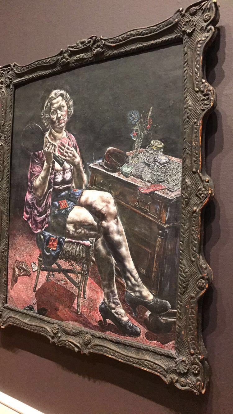
Highlights in the exhibit included: a portrait of an older woman putting on her makeup entitled Into the World There Came a Soul Called Ida (hilariously the actual model was a 19 year old girl and boy how pissed she must have been when she saw the finished product); a series of haunting but mesmerizing self-portraits Albright made in his final years; a psychedelically revolting rendering of the Portrait of Dorian Gray that Albright was commissioned to paint for the final reveal when the novel was adapted into a film and which caused a sensation in the city when it was first showcased; the portrait that marked the beginning of Albright’s development of his signature style entitled Flesh (Smaller than Tears are the Little Blue Flowers); an oddly menacing portrait of a young man entitled the Lineman; a really wrinkly, flabby portrait that elicited cries of blasphemy due to its title And Man Created God in His Own Image; a portrait that is relatively more charitable to its subject, a grizzled old sailor, entitled Heavy the Oar to Him Who Is Tired, Heavy the Coat, Heavy the Sea; and a dreamlike nude portrait mysteriously titled Three Love Birds.


After the Albright exhibit, we made our way back to the American wing for a gallery of early twentieth works which bare the influence of the European Impressionists but don’t quite go as completely strange as the later modernists. Highlights for me included: the utterly charming diptych Himself and Herself by Robert Henri; a gorgeously colored painting by George Wesley Bellows that captures the childlike joy of a first snow entitled Love of Winter; a captivating cityscape by Gifford Beal fittingly named The Puff of Smoke after the image that dominates the scene; a dynamic painting by Everett Shinn of a high-flying circus performance at The Hippodrome London; a bustling, lively painting of young ladies at a restaurant entitled Renganeschi’s Saturday Night by John Sloan.


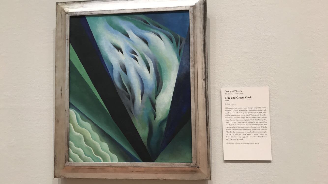
Next up were some paintings that explored more abstracted representation. Highlights here for me were: a piece by the wildly named Knud Merrild (sounds like a Star Wars character) that broke down the distinctions between sculpture, painting, and collage with carefully layered cut out pieces of painted masonite and wood called Aesthetic Function in Space; a very boldly colored landscape with four sickly nudes called by Summer William Zorach; a still life of a dinner table by Stuart Davis that cleverly messes with your sense of perspective the more you look at it; a cubist portrait that radiates a sense of sweetness with its softs colors and fluid brushstrokes called Mrs. Darrow by Manierre Dawson; an early cubist painting by Diego Rivera that almost looks more like a collage than a painting called Portrait of Marevna; a dramatic painting by Arthur Dove called Dogs Chasing Each Other that feels like it is almost pure motion and teeth; and two calming, dreamy abstractions by Georgia O’Keeffe called Ballet Skirt or Electric Light and Blue and Green Music respectively.


Next up was a special exhibition dedicated to the works of Danish silversmith Georg Jensen and his design firm. This showcase really highlighted the potential for beauty in the mundane with some of the most stunning tableware you’ve ever seen. I’ve really grown to appreciate the skill that goes into good design over this year of visiting so many art museums, and I thought the pieces in this gallery were really exceptional, serving as an excellent display of the sleekness and malleability of silver as a medium.


After the silverware, it was back to the last few galleries of the American wing for some more modernist works that skewed more representational but with bold and interesting stylistic flourishes. Highlights for me included: a deeply homoerotic painting of a Canadian boxer (which was hilariously viewed by contemporary critics as a very heterosexual celebration of masculinity) entitled Madawaska—Acadian Light-Heavy by Marsden Hartley; a sweet scene of couples dancing at a jazz club entitled Blues by Archibald John Motley Jr.; a strikingly colored monumental painting of a cigar factory ironically titled And the Home of the Brave by Charles Demuth; a sort of captivating geometric abstraction titled Silver Sun by Arthur Dove; a gorgeously surreal landscape that feels so richly textured and moody entitled Inscription Rock by Raymond Jones; and a vibrant raucous party scene entitled Nightlife by Archibald John Motley Jr..


Probably the most famous piece in this gallery was Grant Wood’s American Gothic which still felt powerfully strange and elegantly composed in person even after seeing the millions of parodies and reproductions in pop culture. I haven’t gotten to go to the Louvre, but I imagine this one’s sort of similar to the Mona Lisa in that there really isn’t much to it, but everything’s so subtly off you can’t help but keep staring and trying to read into it.

Next up we had a collection of pieces by Georgia O’Keeffe, who, in my opinion, always lives up to the hype. My favorites that I hadn’t seen before included: Cow’s Skull with Calico Roses; Black Cross New Mexico; The Shelton with Sunspots; and Red and Pink Rocks and Teeth.


In the center of all the O’Keefe’s were two wonderful sculptures: the whimsically minimalist Miss Expanding Universe by Isamu Noguchi and a cubist pegasus entitled Winged Horse by John Bradley Storrs


Leaving the American Wing, we made our way to the Modern and Contemporary wing. We opted to skip the ancient art because we had already logged several hours of museum-ing and we knew we had at least one more where we were headed but there was still no way I could stop myself from snagging a photo of this truly insane ancient Greek sculpture Young Satyr Wearing a Theater Mask of Silenos. It really strikes that fine line between playful and hellish.

Walking into the Contemporary Wing, we were greeted by a clever piece of visual pun-ing in by textual artist Kay Rosen called Leak, which playfully uses the shared letters in floor and roof to make it look like the “L” fell from the ceiling.


The first gallery we went to in this wing began with works by mid-20th-century surrealists and cubists, which is always a fun place to start for me. Highlights’s here included: the dreamy almost metallic seeming Magnetic Mountain by Kurt Seligman that makes me think of a chess board surging to life; a humorously stately abstracted figure called Ajax by Georges Braque; a gently colored painting of a very gorilla-esque person called Nude under a Pine Tree by Picasso; a cartoonishly hideous (but impressively rendered) portrait entitled Supervielle by Jean Dubuffet; and two pieces by my beloved Joan Miró using his characteristically amorphous figures, The Policeman and Painting (Figure with Stars).


In the middle of this gallery was a sculpture by Alberto Giacometti Walking Man II that kind of alternated between being either menacing or stoic the more you looked at him.

Two of my favorite pieces were by the legendary Belgian painter René Magritte, who combines fantastically bizarre imagery with a genuinely beautiful sense of aesthetics that isn’t particular common among the other surrealists. On the left is On the Threshold of Liberty, a really odd painting of a cannon in a small room divided into different quadrants each with totally different textures, and on the right is Time Transfixed which depicts a steam locomotive emerging from a fireplace.


Next up was a glass display case filled small works by big names. Highlights here included: a funky contraption by Salvador Dalí featuring a shoe, a glass of milk and sugar lumps with photographs on them entitled Surrealist Object Functioning Symbolically; a charmingly doofy wooden Figure by PabloPicasso; an evocative mini-painting called The Eye by Magritte; a small feathered painting by Joan Miró called Man, Woman, and Bulls; small sculptures by Man Ray entitled Puériculture and What We All Lack; the aptly named Woman Bottle by Magritte; and a beautiful but pen and ink drawing by Dali of his wife entitled Portrait of Gala with Two Lambchops in Equilibrium Upon Her Shoulder.


In the next room my favorite pieces were: a portrait that seemed to shifts itself before your eyes entitled Painting of Madame X by Francis Picabia; a painting by Tarsila do Amaral called City (the Street) featuring three funky little guys in giant red shoes making their way in the big city; and a really dreamlike painting of large and small forms seeming to melt away called Midday Sorrows by Angel Planells.


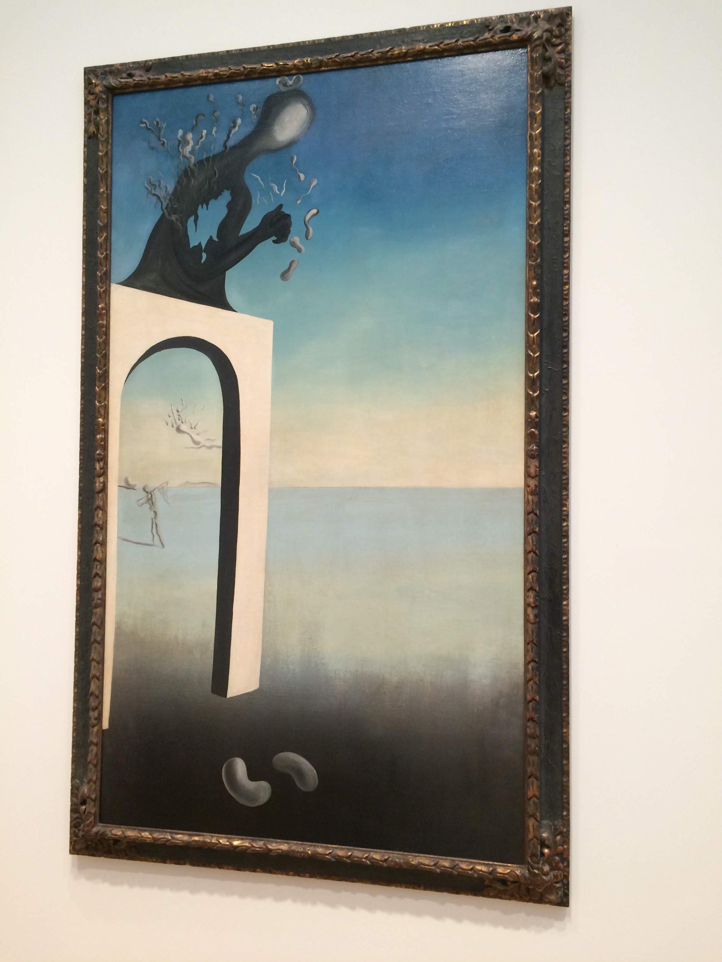
Next were some characteristically beautiful and enigmatic dreamscapes by Salvador Dalí that seem to exist in an endless desert. My favorites included: Dream of Venus formerly Visions of Eternity; A Chemist Lifting with Extreme Precaution the Cuticle of a Grand Piano; and the Invention of Monsters


Next up were some pieces by one of my absolute favorite artists: Max Ernst. These included: a painting of a woman running away from what appears to be a horse and a man made out of choral fascinatingly entitled Spanish Physician; a moody nighttime scene entitled Forest and Sun created using techniques developed by Ernst entitled frottage and grattage which generate unique patterns and textures by rubbing grooved surfaces on the canvas and scraping away almost dry paint respectively; another fascinatingly textured night scene entitled Summer Night in Arizona; a really sweetly cute piece of a little cartoon man with an overlaid smaller painting of two white birds fittingly called Human Figure with Two Birds; and a mysterious but oddly engrossing abstraction entitled The Blue Forest.


Walking to the next gallery, we passed a display of simple but elegant minimalist sculptures by Costantin Brancusi.

In the next small gallery, I was struck by two works that dramatically grappled with the atrocities during and leading up to WWII. On the left, Marc Chagall’s White Crucifixion used biblical imagery to call attention to the persecution of Jews across Europe and it was painted in 1938 before the war officially began which shows that even if people didn’t know how bad the Holocaust would get, they could have stepped in much earlier when things were already quite bad. On the right, George Grosz’ God of War uses a more dreamlike swirl of violent imagery to bombard the viewer with flashes of Nazi horrors, perhaps most chillingly the little Nazi Youth manning a machine gun.


On a less intense note, the next gallery featured works inspired by the shifting perspectives of cubism. My favorites here included: the sweetly geometric Reclining Woman by Fernand Léger; a hypnotic untitled piece by Le Corbusier featuring corseted women and pompous men; a dreamily colored piece by Giorgio de Chirico that subverts classical forms called The Eventuality of Destiny; a hilariously monstrous piece by Picasso just called Figure; a Still Life where I’m not totally sure what anything is by Picasso; and a stately cubist sculpture called Woman with Hair in a Bun by Julio Gonzalez.


After all the funky Picassos thus far, I was particularly struck by this more representational but kind of stunning painting of his called Mother and Child.

The next gallery had pieces that reminded me a bit more of the Impressionists with their focus on dazzling colors. Highlights for me here included: a mesmerizing landscape entitled Farm near Duivendrecht by Piet Mondrian (who’s more famous for geometric abstractions); a really vibrant painting by Matisse that I did a terrible job photographing called Daisies by Matisse; a contemplative scene of a woman staring deep into the souls of her fish entitled Woman Before an Aquarium by Matisse; a hazy scene of a woman sitting on her hotel balcony painted at a striking angle by Matisse and entitled Interior at Nice; and the peaceful Reclining Nude by Max Beckmann that almost seems to glow with inner light.


Next up were pieces that moved more towards pure abstraction. Highlights for me included: Piet Mondrian’s cooly minimalist Composition No. 1; a very simple but oddly captivating piece matter-of-factly called Curving Function Greenish Brown by Georges Vantongerloo; a pointillist abstraction that features some very deceptively neat layering of forms and colors called Sunset by Paul Klee; a geometric piece with ominous undertones entitled Death in the Garden by Paul Klee; a spectacular blend of playfully juxtaposed forms, textures, and language entitled Broken and Restored Multiplication by Suzanne Duchamp (equally talented sister of the more famous Marcel); and a dynamically fluid explosion of color called Edtaonisl (Ecclesiastic) by Francis Picabia which was humorously (though not obviously) inspired by a ship voyage he took where he noticed that a priest on board never missed a chance to watch a particular dancer perform and rehearse.


At the center of these pieces was a really cool geometric sculpture that looked like a sort of imaginary architectural object entitled Interrelation of Volumes from the Ellipsoid by Georges Vantongerloo.

Next up was a series of paintings by German Expressionists Landscape with bold color choices and strong dramatic lines. Highlights for me here included: a swooping painting of a horse-drawn carriage entitled Painting with Troika by Vasily Kandinsky; a joyful exuberant painting of street musicians and onlookers entitled Carnival in Arcueil by Lyonel Feininger; a mysterious, but really pretty painting entitled Two Girls in a Garden by Karl Schmidt-Rottluff; a hilariously grumpy portrait of two people named Natalia Goncharova and Mikhail Larionov by Aleksei Morgunov, a Russian painter inspired by his German counterparts; a wonderfully strange scene packed with so many little idiosyncracies entitled Small Town by Day by Georg Scholz; and a dreamy vibrant painting of constellations by an artist whose name I didn’t record unfortunately.


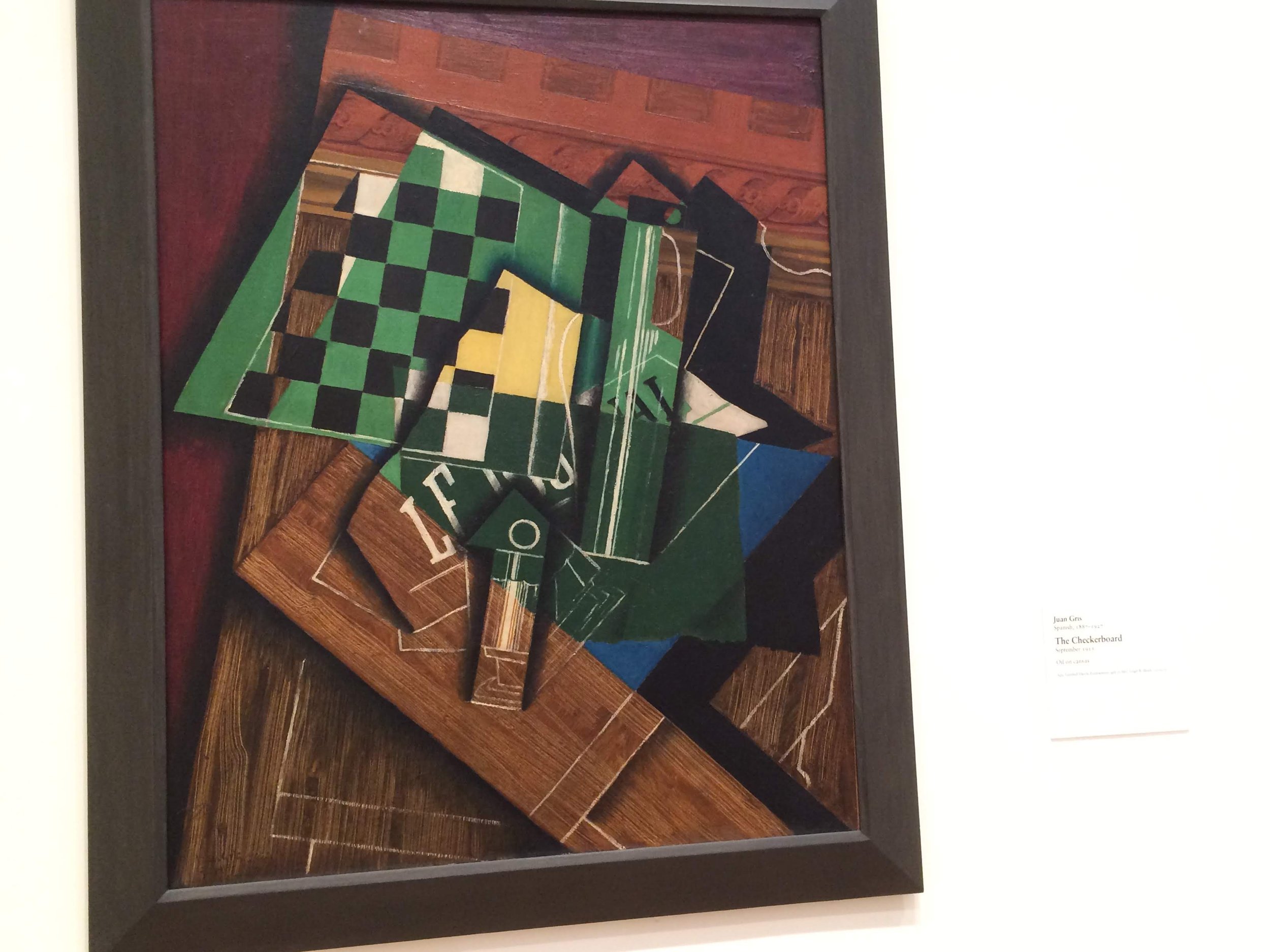
Up next we had some more Cubism, which seemed to be the dominant style represented in the Modern Wing. Highlights for me here included: a cool angular Portrait of Picasso by Juan Gris that seems like a kinder portrait than the ones Picasso usually made of others; a really neat painting by Picasso entitled Man with a Pipe that impressively captures several different textures all interwoven together; a still life of a Checkerboard by Juan Gris that features a real fun use of contrasting colors against the wooden grain of the table; another piece by Juan Gris called Abstraction Guitar and Glass that achieves an almost three-dimensional effect; a vibrant energetic painting of a Parisian carousal entitled Festival in Montmartre by Gino Severini; and a whimsical painting of animals approaching a waterfall called The Bewitched Mill by Franz Marc.


My favorite of these Cubist pieces was the absolutely stunning Woman with a Fan by Jean Metzinger which really elegantly delivers on the idea of capturing its subject from multiple perspectives at once.

Amid the paintings, there was a funky limestone sculpture by Jacques Lipschitz called Seated Figure that looked like it would be really fun to touch.

Next up we circled back around into some surrealism. Highlights here included: a fairy tale-esque painting of an imaginary jungle called The Waterfall by Henri Rousseau; an early, more traditionally representational painting by Joan Miró called Portrait of Joaneta Obrador; an energetic yet minimalist painting by Man Ray called Departure of Summer that is pretty striking (even if the woman on the left sort of looks like Elivs); and an enigmatic still life of artichokes, canons, and a train in the distance called Philosopher’s Conquest by Giorgio di Chirico.


One of the largest and most captivating pieces was a large mural by Matisse called Bathers by a River that featured his characteristic flair for color but utilizations a much darker, stranger figuration for its titular bathers with two of them seeming to fade into the background and two stadning hauntingly faceless. It’s at once calm and unsettling in a really cool way.

Near the Matisse mural, there were two really impressive but radically different pieces by Picasso, the somber, beautifully representational The Old Guitarist and a chaotic but vividly painted cubist portrait of someone named Daniel-Henry Kahnweiler where the figure almost jumps out of the canvas once your eye sees it among the abstract shapes.


On the three-dimensional front these pieces were accompanied by a sweetly lumpy sculpture by Henry Moore that served as a model for a larger scale version of the same Reclining Figure at the headquarters of the United Nations Educational, Scientific, and Cultural Organization in Paris.

Lastly before moving into the contemporary wing there was a collection of surrealist works on paper. Highlights for among these funky sketches, drawings, and collages, included: bizarre elongated figures (and a very normal sink) in an untitled piece by Wilfredo Lam; a drawing called Mother and Child by Wilfredo Lam that felt like a blend of super cartoony and more classically mythological imagery; a playfully simplified drawing called Two Nude Women by Jean Dubuffet; a sort of cute but kinda freaky drawing of Bird People by Max Ernst; a piece by Joan Miró hilariously just called Woman; a beautifully dreamlike untitled drawing by Giorgio Di Chirico; a captivatingly minimalist mix of drawing and watercolor called Viticulture by Joan Miró; an amorphous charcoal and oil paint drawing called Standing Woman by Joan Miró; a mysterious and haunting painting of nudes on the run called The Lamps by Paul Delvaux; a spooky pen and ink drawing by Salvador Dalí called the Formation of Monsters that features a pretty neat optical illusion where the left half of the woman’s face turns into another face; a hilariously unsubtle phallic drawing by Dalí calledThe Anthropomorphic Tower; and a lovely dreamy painting by Magritte called the Banquet of a simplified red sun superimposed over a more realistic landscape.


These pieces were accompanied by some fun minimalist sculptures including Picasso’s fairly rude cardboard Devil and Max Ernst’s charmingly goofy An Anxious Friend.


A big highlight for me was a series of playful but thoughtfully composed surrealist collages by some pretty big names in the movement. These included: a hypnotic mix of paint, drawings, and cut up photos by Max Ernst; a blend of cut and paste images and drawings by Joan Miró that makes me think of Terry Gilliam’s Monty Python cartoons; a dramatic blend of watercolor figures in flight over collaged photography by Max Ernst called Massacre of the Innocents; an impressively seamless collage of Victorian drawings that really looks like it was always one image entitled Marceline and Marie by Max Ernst; and a beautifully colorful abstraction of fanned out cut and paste pictures called Camera Obscura by Roland Penrose.


My favorite part of the gallery (and one of my favorite things I’ve seen in any museum) was a series of Exquisite Corpse drawings made as a party game while famous artists were hanging out. The game entails folding a piece of paper in fourths or thirds and having each person draw a different part of the body without seeing what the whole figure looks like until the paper is unfolded. I used to play this all the time with my cousins, so it was fun to see that the resulting absurd creations were as amusing to great artists as they were to weird kids in the suburbs. My favorite freaky little drawings were: one by Yves Tanguay, Man Ray, Max Morise, and Andre Breton; one by Man Ray, Yves Tanguay, Joan Miró, and Max Morise; and one by Max Morise, Max Ernst, and André Masson.


Moving into the contemporary wing, we started off with some large scale abstractions. Highlights for me included: a swirling chaotic Jackson Pollock piece called Greyed Rainbow; an untitled piece by Ed Clark that dramatically bursts out of the borders of a traditional rectangular canvas; a piece that seems to glow and almost take on a more human form called The Annunciation by Jay DeFeo; and a piece by Jasper Johns that looks at first like a completely grey canvas until you start to make out the recognizable form of the American Flag in a neat display of just how much common symbols can retain their image even when stretched to the point of near abstraction.


In this gallery, there was also a really lovely wooden sculpture by Barbara Hepworth called Two Figures which had a gentle calming presence.

Next up we had some Pop Art, with the highlights for me being: a very resigned comic book lady by Roy Lichtenstein; a stunningly textured painting by Ed Ruscha where a ring of water turns into the word “City” with an uncanny feeling that whole painting is somehow liquid; a charmingly sassy Untitled piece by Theresa Burga where the canvas has been cut into the form of its very fashionable subject; a study in shape and color by Judy Chicago in which she playfully upends your conception of the seemingly abstract piece with the very rude pun of title 3 Star Cunts; two large sculptures of light switches by Claes Oldenburg, one more realistically textured and one made of sagging soft materials; and a classic Andy Warhol screenprint of Marilyn Monroe, that is almost synonymous with the term Pop Art.


One of the coolest and largest pieces of Pop Art was a portrait of American Art Collectors Fred and Marcia Weisman by David Hockney. Every detail was vividly captured but the composition was also deceptively strange in just about every way from the poses of the subjects, to their dress, to the apparent flatness of the building behind them to the offbeat-ness of the works from their collection they’ve chosen to stand beside. It’s the kind of painting where you just keep noticing fun little things the more you stare at it (for example I didn’t realize til I was writing this that Fred Weisman is squeezing a tube of paint in his hand).

Next up we had some more abstract pieces that were focused on really playing with shape and color. Highlights for me here included: Alma Thomas’s Starry Night and the Astronauts which she made when she 77 (!) and features a soothing, rhythmic use of repetitive daubs of different shades of blue and one striking patch of red, orange, and yellow; and an Untitled piece by David Novros that features fifteen panels of different colored canvases carefully cut up and arranged to create an immersive effect that draws you in despite there not really being anything particularly dramatic going on (except perhaps the strategic use of negative space).

The next gallery was filled with technically impressive and deeply strange contemporary sculptures. Highlights for me were: a piece by Katharina Fritsch made out of polyester, iron, and wood depicting a large scale rendering of fancy lady and her little dog made seemingly made out of seashells; a disturbingly lifelike and unreal at the same time Pinocchio-esque sculpture called Boy by Charles Ray; and the deceptively simple Dictionary for Building: Fireplace Mantel by Siah Armajani, which blends poetry (taken from Robert Frost’s the Hill Wife), architecture, and sculpture by taking a seemingly normal fireplace mantel and adding mirrors, text, and surprising repetitions of certain features to make it almost seem to go on an infinite loop.


The next gallery was filled with a mix of photographs that looked like they could be paintings and paintings that looked like they could be photos. In the former camp, I was really blown away by these pieces by an artist named Cindy Sherman, who carefully staged and composed these self-portraits to create dramatic, emotionally charged tableaus where you almost feel like there’s a whole novel’s worth of details extending beyond these captured moments.


On the photorealistic painting side of things, my favorites included: a painting by Vija Celmins of a bombed aircraft carrier entitled Explosion at Sea which look shockingly like a WWII-era photograph for something painted in 1966; a scene called Stamford After Brunch by John Currin that looks startling lifelike until you start noticing weirdly off proportions in the faces and arms that create a sort of disorienting uncanny valley effect; and a moody seascape entitled Venice (Staircase) by Gerhard Richter that looks like a faded polaroid.


Moving into the next gallery, I was really captivated by a painting called Slumber Party by Eric Fischl that had a dreamy quality to that somehow captured both a sweet nostalgia for childhood innocence and an unsettling sense that such carefree playdates are soon coming to end for these kids just on the verge of puberty. The text from the museum compares it to a mixture of Edward Hopper and David Lynch, which feels pretty much spot on.

Next up we had more works by Andy Warhol. These included: a series of starkly composed silkscreen prints of a nude photo of the art dealer Pat Hearn; an ominously psychedelic silkscreen print entitled Big Electric Chair; an aptly named piece called Four Mona Lisas that features four subtly unique prints of the classic painting; and the powerful (though perhaps in questionable taste coming from Warhol) composition Little Race Riot.


Next up were some works of conceptual abstraction playing with the ideas of text, numbers, and diagrams as purely images removed from meaning. These included the carefully composed chaos of Cy Twombly’s Untitled painting which looks like a mess if you try to make sense of the actual text but features a pretty neat exploration of the gestural possibilities of combining pencil and crayon drawing onto wet paint; and an exuberantly colorful painting of the number four (given some cool texture from elements of newspaper stuck to the canvas) entitled Figure 4 by Jasper Johns.


The next gallery featured some large-scale Pop Art sculptures by divisive figure Jeff Koons, who used to work for Wall Street and does bring a sort of soulless commercialism to his artwork which may or may not be intentional. He seems like a grade-A douche bag based on every interview I’ve ever read with him, but he does occasionally have a knack for visual flair and I didn’t hate these pieces even if I’m not the biggest fan of the guy himself. The ones I liked included: a decorative mirror entitled Christ and the Lambs where the reflective surface is actually an image lifted from a Da Vinci painting of baby Jesus playing with a lamb; a cheeky sculpture called Woman in Tub where artist brought to life a cartoon he saw on a novelty rude greeting card; and a piece called Bourgeois Bust featuring a rococo style bust of Koons and his first wife, an Italian pornstar named Ilona Staller cut into the shape of a heart.


On the wall of this gallery were works by Roy Lichtenstein who is probably my favorite of the Pop artists. Highlights for me were: a riff on Mattise entitled Artist’s Studio Foot Medication which playfully imagine Lichtenstein’s apartment as a grand salon style artist’s studio with various paintings within paintings ; and a painting called Woman III that shows Lichtenstein putting his spin on Abstract expressionism with carefully flattened overly exaggerated paintings of brushstrokes.


Another big highlight taking up one whole wall of the gallery was the delightful and even more delightfully named Mr. Pointy by Takashi Murakami.

Next up was a gallery of works by Japanese Abstract Expressionists, specifically by members of the influential avant-garde collective the Gutai Art Association. The Gutai artists built on ideas they liked from Western Abstract Expressionism, namely a focus on the art being an extension of the artist’s body, and really ran with it in dynamic and innovative ways. Their manifesto of artistic purpose put a big emphasis on pure creativity and playfulness, seeking to make art in ways that hadn’t been tried before and to use the joy of creating as a means of rebellion against an increasingly conservative and consumerist post-war society. Their works combined sculpture, painting, and performance art, and while western critics initially found them derivative of Pollock (very much ignoring the fact that Pollock was himself inspired by Japanese art) they’ve since been given their critical due as an important, influential, and just pure fun part of art history.
Highlights for me included: a piece called Golden Wings Brushing the Clouds Incarnated from Earthly Wide Star (Chikatsusei Maunkinshi) by Kazuo Shiraga which he actually painted with his feet to force himself to create new and interesting brushstrokes; a piece simply titled Work by Saburo Murakami which featured a collage of splattered paint, torn papier-mache, and a small wooden box that sort of serves as grounding force to all the chaos; and an Untitled piece by Atsuko Tanaka exploring the tension between very controlled, meticulous circles of color and wild unrestrained lines swirling around and through them.


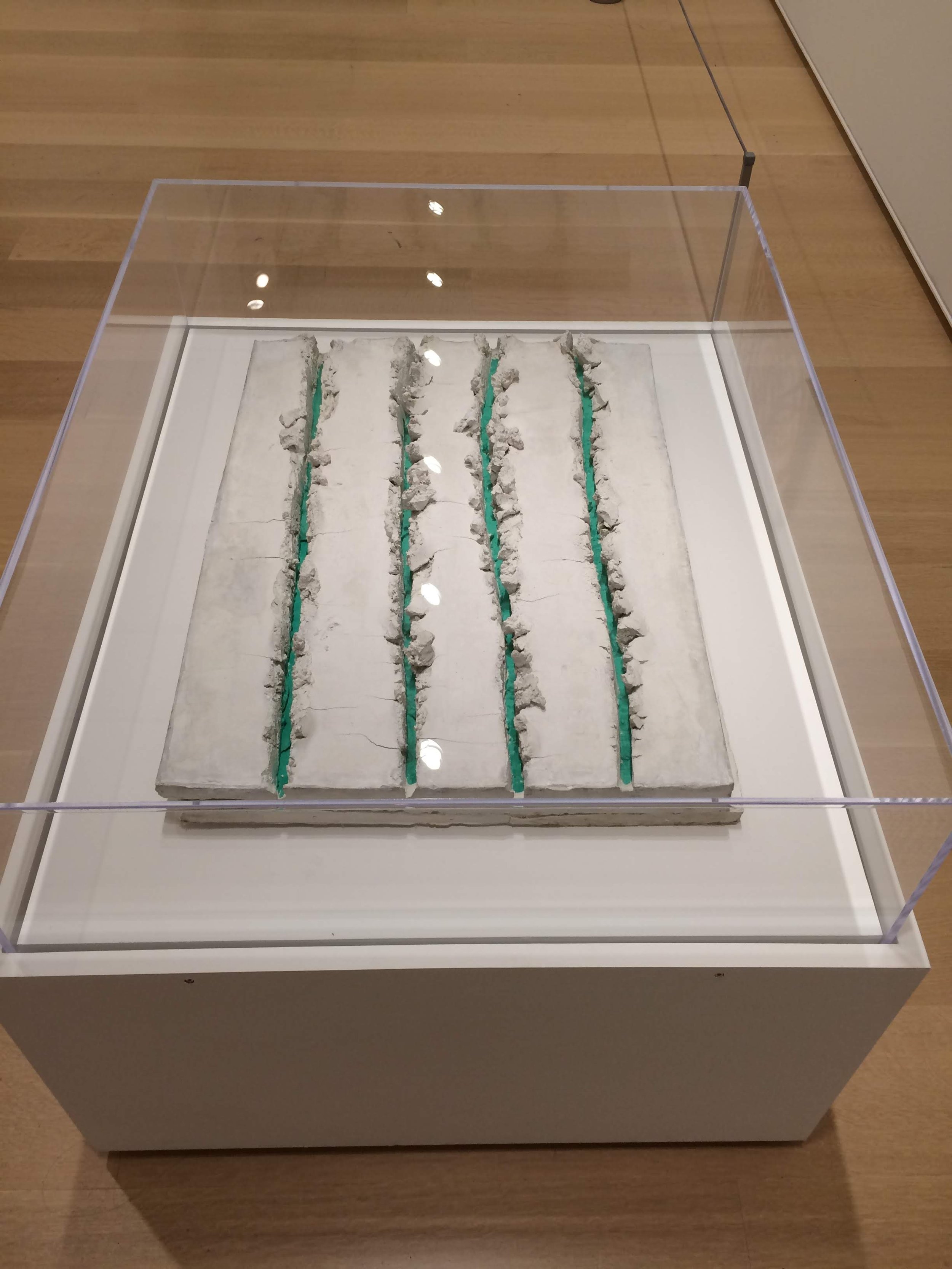
My favorite piece in this gallery was the sole sculpture, a minimalist piece called Sakuhin by Fujiko Shiraga. The piece as you walked up to it looked like a slab of concrete but where the artist appeared to rake the surface, bright bands of color were revealed. It’s a simple but effective metaphor for hidden depths and also just a pretty cool visual that makes really smart use of the chosen materials.
Next up was a fun series of works by Lorraine O’Grady that I’d actually seen a couple times while driving around the country so I guess we had similar travel itineraries. The series was called Miscegenated Family Album and consisted of diptychs pairing photos of O’Grady’s family with works of Ancient Egyptian Art, often with striking resemblances. The project is a great blend of the personal and the political combining the simple fun of finding a work of art that looks like someone you love with the more pointed refutation of western art and academia’s constant white-washing of Egypt by drawing attention to the resemblance of leaders from an empire that was very much in Africa with her own African-American family. It at once highlights the beauty to be found in modern Blackness by elevating everyday people to equals of Egyptian royalty and course corrects a view of history that likes to pretend Egypt was in a bubble somehow outside of the rest of the continent.


Similarly themed was a pretty dazzling sculptural assemblage by Kerry James Marshall called Africa Restored Cheryl as Cleopatra. The piece consists of dozens of images, some historic and some careful recreations by the artist, that trace the history of Black iconography and representation delicately arranged into the shape of Africa. It’s so visually dense and precariously arranged that it’s hard not to be sucked into staring at length.

Walking into the next gallery, we were greeted by a stunning work of monumental minimalism called Yellow House by Alex Katz which combines a deceptively simple painting of the side of a house and a window with an intricate web of shadows that highlights the potential for complexity and visual splendor in the mundane.

The next gallery featured works that played with perception and mixed media installation. Highlights for me included: a piece entitled Japanese Couple by Barbara Bloom that paired a moody photo of a Japanese with a folding screen similar to the one in the photo practically encouraging viewers to recreate the scene; a multi-layered piece by Joan Jonas entitled Mirror Pieces Installation II which featured mirrored costumes from a performance art piece the artist choreographed hanging above a mirror facing a TV playing a recording of the performance creating reflections upon reflections and really messing with the viewer’s head; and a deceptively simple but hard to pin work on paper by an artist whose name I sadly didn’t record and could’t find on the museum’s website.


Last but not least was a series of darkly funny, incendiary political cartoons from the artist Gordon Bennett’s series Notepad Drawings, which pointedly critique social ills in Australia, particularly the continued systemic racism and persecution of Aboriginal peoples by white Australians.


At this point, my phone was quite dead from all the photographs (most of these were actually taken with Diantha’s phone) so I didn’t get a chance to photograph one of the museum’s prized pieces: Marc Chagall’s stunning stained glass America Windows. Fortunately, I went back to Chicago a year later for my friend’s wedding so I had a chance to capture it the second time around. I tried to capture the sheer magnitude of the work so I think my photo loses some of the more impressive fine details, but, even zoomed out, the colors and the way the glass plays with light are just gorgeous.

After the Art Institute, we went to see some famous tourist spots in Millennium Park. We started out with a sculpture that is technically called the Cloud Gate but which everyone calls the Bean because it looks like a giant bean. It’s almost always flocked by tourists which I’m sure is annoying if you live here, but it is a genuinely very cool piece of art. On the outside, it distorts the city’s skyline in fun ways, and, on the underside, it warps your own reflection like a funhouse mirror so it makes for a fun viewing experience as you walk around it and I see why it’s become a go-to photo stop. I wanted to just take a photo of the Bean itself, but Diantha insisted I wouldn’t get the full experience if I didn’t do the full tourist thing so here’s me looking like a real dingus.

While the Bean is the most famous bit of art in the park, there is also the pretty delightful Crown Fountain, which features a charmingly freaky video-art installation of the faces of random Chicagoans positioned so it looks like the water is shooting out of their mouths. It’s silly and fun, and it engages the community as well as visitors which is really all you can ask for in public art.


From Millennium Park, we met up with Diantha’s partner Graham, and he joined us for the next chunk of exploring. Our first stop was an impromptu stop just to peek in at the glamorous halls of the historic Chicago Athletic Association. Formerly a hangout of the city’s elites, the opulent building has since been opened to the public as a luxury hotel complete with a fancy restaurant, cocktail bar, and also hilariously a Shake Shack. My phone was dead from the museum, so I didn’t get a picture of the hotel, but even a cursory look through google images gives a pretty good impression of the swanky digs.

I was able to charge up myself and my phone with a pit stop at Fairgrounds Coffee, a local chain with an excellent cold brew on tap that was a welcome energy boost.
Freshly revitalized, the three of us made our way to the Chicago Cultural Center, which is criminally underrated as a tourist destination in the city (even if that’s more of a testament to how much cool stuff is in Chicago than a failure of the Cultural Center). The Cultural Center is housed in an absolutely stunning building that was once the city’s public library. It was built not long after the great fire of 1871, so the city wanted it to really be something to behold in the center of town, a beautiful space for all to gather and share knowledge. In 1977, the space was converted to its current role as a cultural center where it plays host to traveling art exhibits, performances, and various academic programming. Plus they’ve worked to really preserve all the architecture’s inherent grandeur so even if the current exhibits aren’t your cup of tea, it’s always worth a walk-through. Best of all, it’s completely free to visit (they actually have the claim to fame for being the first free municipal cultural center in the entire country)!
We entered through the Washington Street entrance, which means we were greeted by a grand marble archway and beautiful mosaics all along the walls. The white Carrara marble was interspersed with green marble from Connemara, Ireland, and the architecture really highlighted just how naturally pretty the material can be. The natural beauty was complimented by the man-made craft of the intricate glass mosaics, some of which spelled out different quotes from around the world (in their respective languages) about the joys of reading just in case you forgot the building used to be a library.


Next up we went to the third floor to take in one of the building’s crown jewels, a magnificent 38 ft. in diameter stained glass dome by Louis Comfort Tiffany. It is believed to be the largest Tiffany Dome in the world, and it really is a sight to behold. The simple fish-scale pattern was pretty elegant on its own, creating a soothing, mesmerizing, color gradient in the light, but the closer you got to the center of the dome the more intricate the pattern became, culminating in a beautiful circle of zodiac signs.

Even just walking between galleries, the hallways that weren’t decorative still had a strange beauty to them.

Our next stop was on the opposite side of the building: The Grand Army of the Republic Memorial Hall. The hall was built to commemorate and memorialize Union veterans of the Civil War and features another giant, spectacular stained glass dome. The dome here is actually larger than the Tiffany Dome clocking in with a diameter of 40 ft. and it features a more somber color palette. The muted hues and Renaissance-inspired patterns give an impression that dome has sprung into being out of the pages of an artist’s sketchbook.

After the second dome, we moved away from the architectural elements of the Cultural Center and on toward the current special exhibitions. The first exhibit showcased works by the painter Scott Stack. Stack’s paintings primarily consisted of geometric abstractions that created dizzying optical illusions. Some of the pieces honestly hurt to look at because the pulsing patterns were so intense, but the fact that such a visceral response can be generated from simple black and white lines is beyond impressive.


The next exhibition was entitled the Great Lakes Cycle and featured works by the artist Alexis Rockman. In contrast to the more abstract works in the previous gallery, Rockman’s work was vividly representational. Each painting served as a haunting warning about the harm we have on the environment, showing off Rockman’s knowledge and research of wildlife to spectacular effect. The exhibit was centered around massive hyper-textured oil paintings of imaginary natural disasters combining super realistic natural renderings with fantastical (but maybe more plausible than we’d like) chaos. Alongside the murals, there were several smaller watercolors that had a more ethereal, dreamlike quality while still maintaining the attention to detail.


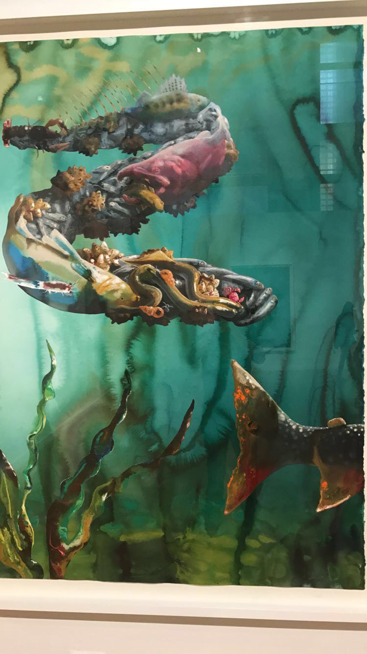


One wall was just filled with smaller watercolors showcasing just a single animal or plant, but these were perhaps some of the most quietly lovely pieces, and I honestly have no clue how the artist was able to get such lifelike textures out of just ink and water.


Walking up to the next gallery space, we got a good look into the Center’s Courtyard, which featured an elaborate installation of whimsical staircases and swing set designed by the Japanese architectural firm Atelier Bow-Wow (fantastic name). The courtyard is completely inaccessible to guests, so the architects chose to makeover the potentially sterile, empty space into an imaginary circus where anything was possible.


Last but not least for special exhibits, there were 36 panels of Keith Haring’s monumental Chicago Mural. The mural has a really sweet origin story, as it was painted over the course of a week in 1989 as a collaborative project between the artist and the city’s public high schools. The mural panels were laid out along the edge of one of the city’s parks, and Keith would paint black outlines in his signature energetic, cartoony style and then high school students would be given a choice of five colors and allowed to let their imaginations fly filling in the outlines. By the end of the week, over 500 students helped participate, and the finished product just as warmth and joyfulness indicative of that playful collaborative spirit.

The mural was housed in the Cultural Center’s Yates gallery which is based on an assembly hall from the Doge’s Palace in Venice and features some of the most elaborate ceiling decorations I have ever encountered.

After the cultural center, we took a water taxi up and down the Chicago River. Since Graham and Diantha actually live in the city, we didn’t shill out for an official architecture tour, but the views from the river in the summer evening sun were so spectacular it still made the casual ride more than worth it. I was particularly excited to see the twin honeycomb towers of the Marina City building complex, which are prominently featured on the album cover of Wilco’s Yankee Hotel Foxtrot, one of the most important indie rock albums of the 21st century.


If you couldn’t tell from all the praise heaped upon the things we saw today I was feeling really happy, and, unbeknownst to me until after I finished the trip, Diantha got this candid shot where I was just having a great time.

After the taxi, we went back to Diantha and Graham’s place where I picked up my car and set out for the night’s open mic. It was at a place called Cole’s Bar, which had the perfect ratio of diviness and warmth to be a classic performing arts bar. True to form they host a number of comedy and music acts every week and that always makes it nice when a mic is at a venue where performances happen regularly because then it’s less likely that you’re ambushing people on their night out.
The mic ended up being on the smaller side but had quality over quantity in terms of comedians. My favorite of the night was a guy named John Torres, who had a Kyle Kinane-esque professionalism onstage, like a classic midwest storyteller, and offstage he was just really nice and friendly to this weird kid traveling through. A joke that stood out to me: “No matter how many times you take the 23 and me your dad's still not coming back”
Other highlights:
Michael Johnson- My father told me not to drink and drive "You might spill your drink"
Micah Green- You know who has it tough these days? Investment bankers. One thing that doesn't separate the rich and poor, even the rich man's diaper doesn't have pockets
Luke Dumond- I was circumcised but two foreskins grew back. I'm like a hydra
Mike Ender - I want to be a lot of things growing up like a fireman, or a policeman, or an airport. I wanted to be an airport and my teacher said, “are you retarded” and I said “you're not gonna be able to say that in 20 years “
I don’t remember my own set particularly well (it has been almost five years) but that means that I probably didn’t do too terrible or too great. If it was a small crowd of mostly comics, it can hard be to gauge just how well you’ve done, because there’s usually more appreciation than outright laughter at good material, but you still can tell for sure when you’ve really whiffed it so I think at the very least I didn’t do that.
After the mic, I explored the nightlife in the hip neighborhood of Logan Square, which Graham and Diantha said should be a fun hangout. I ended up spending almost the whole time at a bar that I passed by that I saw had a bunch of pinball machines called the Emporium Arcade. As some lucky turn of fate, I visited on a night when there was a special deal where all the pinball was free so suffice it to say I was there a while.
Outside of the games, it was a really fun bar with tons of options from local craft breweries. I tried something from a brewery called Moody Tongue because I thought their name was funny but it turns out they actually have a Michelin star for their brewpub’s complex food and beer pairings. I got a decadent caramelized chocolate porter and it was truly delicious.
At one point mid-pinball, I needed a late-night snack so I walked to the nearby Redhot Ranch for their signature double hot dog and fries. It was no frills (and my photograph looks unhinged) but it was the perfect comfort food to eat on the go because naturally I still had to get back for more pinball.

Favorite Random Sightings: a daycare called Pickle's Playpen; a construction company called DIRTT; flyers for an actual Sausage Fest; a bar called the Tiny Tapp
Regional Observation: Chicago has great public art everywhere, both in terms of official installations and excellent street art.

Random Joke of the Day: A man who worked at a fire hydrant factory was always late for work.
When confronted by his boss the man explained, "You can't park anywhere near this place!"
Song of the Day: